A very useful source I found was Typography Deconstructed website which has a large source of typographic knowledge
 |
| "Anatomy of Type Poster" (2010) by Typography Deconstructed Typography Deconstructed (2010) "Anatomy of Type" [Internet] Available from http://www.typographydeconstructed.com/shop/products/digital-poster/ (Accessed 27th November 2013) |
From this poster, I looked up some of the physical attributes to type which I felt could constitute as a possible restaurant concept.
 |
| Traditional Names |
I went onto looking at names which would give a very good concept rather than a typical name for a restaurant.
 |
| Abstract Concepts |
Eventually I decided to go for Swash, a typographical flourish, which made me think of Pirates which made me shape and mature it into a seafood restaurant. I went onto having a look at seafood dishes to see which I can include onto my menu. I didn't want to have a large range as I want the restaurant to be independent and specific.
 |
"Seafood Recipes" by Jamie Oliver
Oliver, J. "Seafood Recipes" [Internet] Available from http://www.jamieoliver.com/recipes/seafood-recipes/ (Accessed 4th January 2014)
|
 |
"Christmas Eve Seafood Dishes" (2012) by Adolph Di Mambro
Di Mambro, A. (2012) "Christmas Eve Seafood Dishes" [Weblog] granpalovetocook 23rd December Available from http://granpalovestocook.blogspot.co.uk/2012/12/christmas-eve-seafood-dishes.html (Accessed 4th January 2014)
|
What I found from this was that the best seafood meals are those which are presented in high quality luxurious manner. This has helped my considerations in regards to the meal quality and the audience that I am going to focus on.
I went onto looking at web and print designs that I felt were either good restaurant references or specifically to do with Seafood.
 |
"Italio" by PUSH
PUSH "Italio" [Internet] Available from http://www.pushhere.com/case-study/italio/ (Accessed 31st December 2013)
|
 |
"Iceberb Seafood Restaurant" (2011) by Meidei
Meidei (2011) "Iceberb Seafood Restaurant" [Weblog] The Behance Network 16th June Available from http://www.behance.net/gallery/Iceberb-Seafood-Website/1634569 (Accessed 31st December 2013)
|
 |
"Whitman NYC" by Gin Lane Media
Gin Lane Media "Whitman NYC" [Internet] Available from http://portfolio.ginlanemedia.com/portfolio/#Whitman%27s+NYC (Accessed 31st December 2013)
|
 |
"Cantilever Fish & Chips" by Evolutia
Evolutia "Cantilever Fish & Chips" [Internet] Available from http://www.evolutia.co.uk/work (Accessed 31st December 2013)
|
 |
"Neptunus Seafood Website" (2013) by Joel Vereycken
Vereycken, J. (2013) "Neptunus Seafood Website" [Weblog] The Behance Network 10th October Available from http://www.behance.net/gallery/Neptunus-Seafood-Website/11404053 (Accessed 31st December 2013)
|
Based on my idea to produce a Seafood restaurant, I went onto looking at design inspirations on Seafood Restaurants to see what I would be able to include and the style I want to go into:
 |
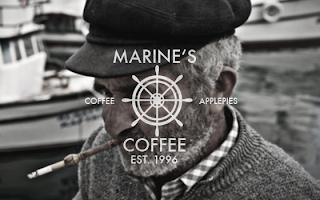
"Marine's Coffee" (2013) by Michael Wekesser
Wekesser, M. (2013) "Marine's Coffee" [Weblog] The Behance Network 30th October Available from http://www.behance.net/gallery/MARINES-COFFEE/11812201 (Accessed 3rd January 2014)
|
 |
"iFish Seafood Restaurant" (2013) by Haifa Hadi
Hadi, H. (2013) "iFish Seafood Restaurant" [Weblog] The Behance Network 25th December Available from http://www.behance.net/gallery/iFish-Seafood-Restaurant/13353715 (Accessed 3rd January 2014)
|
 |
"La Fish" (2013) by Hey Renata
Renata, H. (2013) 'La Fish" [Weblog] The Behance Network 1st September Available from http://www.behance.net/gallery/Lafish/10674077 (Accessed 3rd January 2014)
|
 |
"Seafood Grill" (2013) by Sundus Asif
Asif, S. (2013) "Seafood Grill" [Weblog] The Behance Network 10th November Available from http://www.behance.net/gallery/Logo-Design-Seafood-Grill/11157435 (Accessed 3rd January 2014)
|
The modern and clean brand identity for this restaurant is very simple and makes for a sophisticated restaurant. The branding is consistent throughout the print and web establishing the restaurant firmly in the mind of the locals. The fact that it comes across as a relaxed yet mature place to dine would encourage potential diners to come through the doors.
 |
"The Oyster Factory Seafood Restaurant" (2013) by Mia Almaguer
Almaguer, M. (2013) "The Oyster Factory Seafood Restaurant" [Weblog] The Behance Network 22nd October Available from http://www.behance.net/gallery/The-Oyster-Factory-Seafood-Restaurant-and-Bar/11647921 (Accessed 3rd January 2014)
|
This brand identity oozes exclusivity as it has a textured background and a silver and gold serif text. This gives the impression that the restaurant is for upper-class rich customers who can afford meals like oyster. The brand is quite restricted by the lack of collateral and could be expanded into something much more.
 |
"Mr. Crabs Restaurant" (2013) by Fransisca Oktiviani and Shelvy Wijayanti
Oktiviani, F. and Wijayanti, S. (2013) "Mr. Crabs Restaurant" [Weblog] The Behance Network 1st December Available from http://www.behance.net/gallery/MR-CRABS-RESTAURANT/12698051 (Accessed 3rd January 2014)
|
This broad range of collateral of print and web for the restaurant is illustrative and playful which gives the impression of being open and inviting. The restaurant design mixes illustration and photo-manipulation to get a strong brand identity that is appeal to all the family.
 |
"Seaside Cafe and Restaurant" (2013) by Sorbet
Sorbet (2013) "Seaside cafe and Restaurant" [Weblog] The Behance Network 16th January Available from http://www.behance.net/gallery/Seaside-Cafe-Restaurant/6691715 (Accessed 3rd January 2014)
|
The brand identity for this seaside cafe is that it is quite bland and plain yet it is very fitting to the atmosphere and tone of voice necessary for a seaside based cafe. The colour scheme is quite fitting and work very well together, as the pastel shade compliment each other and don't seem too overpowering, giving the cafe a quiet yet quaint characteristic which is reflected in the font choice.
 |
"Gills Seafood" (2013) by Phil Nehammer
Nehammer, P. (2013) "Gills Seafood" [Weblog] The Behance Network 7th February Available from http://www.behance.net/gallery/Gills-Seafood/7049411(Accessed 3rd January 2014)
|
 |
"JUNCALITO" (2014) by La Carbonera
La Carbonera (2014) "JUNCALITO" [Weblog] The Behance Network 2nd January Available from http://www.behance.net/gallery/JUNCALITO-Restaurant-Bar-/13452931 (Accessed 3rd January 2014)
|
 |
"22 Ships" (2013) by Foreign Policy
Foreign Policy (2013) "22 Ships" [Weblog] The Behance Network 12th June Available from http://www.behance.net/gallery/22Ships/9260143 (Accessed 3rd January 2014)
|
The use of letterpress printing to give the impression of being aged works well with the worn and aged appearance of the collateral as it makes you imagine that these had been found from a shipwreck. All of the collateral are unified without being exactly the same so they work on an individual basis as well as together thereby keeping the brand identity string throughout. The choice of the red colour wouldn't make you think of a seafood restaurant but it goes well wight he worn, shipwrecked theme as it looks like it has rusted away.


No comments:
Post a Comment