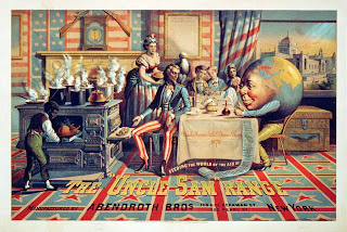
For our first Context of Practise Study Task essay, we had to produce a 500 word analytically comparative essay for Savile Lumley's "Daddy, What did YOU do in the Great War?" and Schumacher & Ettlinger's "The Uncle Sam Range".
 |
| "Daddy, What did YOU do in the Great War?" (1915) by Savile Lumley Reference-Available from http://collections.vam.ac.uk/item/O74621/daddy-what-did-you-do-poster-lumley-savile/ (Accessed 9th Oct 2012) |
 |
| "The Uncle Sam Range" (1876) by Schumacher & Ettlinger Reference- Available from http://www.bridgemanart.com/asset/192095/American-School-19th-century/Poster-advertising-the-'Uncle-Sam'-Range-manufact (Accessed 9th Oct 2012) |
“The Uncle Sam Range” is an 1876 Advertisement to encourage consumers to buy an oven whereas Savile Lumley’s 1915 “Daddy, what did YOU do in the Great War?” poster is a piece of Propaganda to promote volunteering in the army during the First World War.
The potential audience for both posters is directed at the middle class, particularly at the patriarchal familial role based on the primitive need to provide for the family. “The Uncle Sam Range” puts the male at the head of the table making him a commanding presence and highlighting his power, however, “Daddy, what did YOU do in the Great War?” has the male show uncertainty and doubt as Lumley plays on the anxieties and social pressures of a quintessential Englishman.
A concurrent theme within both posters is Patriotism. “The Uncle Sam Range” uses patriotic Americana with references to American history, such as the Eagle and the African- American slave, as well as the colouration of red, white and blue. Likewise, Lumley uses historic context in “Daddy, what did YOU do in the Great War?” yet he uses temporal shift to transport the audience to a future where the war has been won (use of the words “Great War”) and has depicted the country in a state of affluence. The posters both reflect a lifestyle that’s to be aspired to.
Separating the posters is the tone of voice directed at the audience as both take different approaches to appeal to their target market. The saloon- bar style typography uses gold colour to indicate a rich and superior aesthetic in “The Uncle Sam Range”, playing on the idea of the existence of the American Dream. The celebratory tone continues with reference to the 100 year anniversary of America’s independence and the rest of the world being a guest at its celebrations. However, America is presented as the main power in regards to cultural sophistication and superiority through the unsympathetic, oafish depiction of Africans and the stereotypical listings of other countries. On the other hand, the question in “Daddy, what did YOU do in the Great War?” is asked by a child therefore making the tone of the poster emotive and appears innocent yet really is manipulative as it plays on the defeatist guilt of the father. The fact that the font used in the question capitalises and underlines the ‘YOU’ coupled with the father staring out, appealing, to the audience allows the question to be directed to them as well. This tone is then reinforced by the surrounding propaganda of the children’s toys and books which provide a visually subtle hint to the audience.
As “The Uncle Sam Range” settles on a visually extravagant and elaborate celebratory illustration of American life to sell its oven to, not just American’s but, the whole world, whereas “Daddy, what did YOU do in the Great War?”Style choice is subtle and muted but has just as much impact showing how you don’t need a busy visual to get your point across.


