Thursday, 12 December 2013

Context of Practise 2: Lecture Notes- "What Is Research?"

Thursday 12th December 2013
"What Is Research?"
Richard Miles

Research is a legacy of the age of The Enlightenment

The Age of Enlightenment in the 18th Century
- Process of rationality and reason where science/ philosophical thinking made leaps and bounds of progress
- Secularisation
- Reason rather than Metaphysics (Spirit or Soul- Non-Scientific)
- Belief in a unified scientific method (Scientism)
- Positivism
- Art and Design wasn't put into Universities originally as it wasn't based on scientific research and not providing valuable knowledge
- System which is antagonistic towards Art and Design Research and Degrees

"Two Cultures and the Scientific Revolution" (1959) by C.P. Snow
- 2 totally inseparable cultures which were two different things
- They would never be able to fuse together/ work alongside each other

Positivism
- A school of thought interested solely in Facts
- Research should always lead to positive definite knowable outcomes
- Separation of fact from value (Value freedom)
- Objectivity
- Measurement rather than Argument- Facts speak for themselves
- Causation, Separation, and Control of Variables
- Rigorous and Underlying Principle behind it

In order to pass our degrees, we have to pass this scientism

Approaches to Research:

  • Empiricism
  • Quantitative Research
  • Qualitative Research
  • Subjectivism

Empiricism
- Research that is done through setting up an experiment and observing
- The common sense legacy of scientific positivism
- Universally regarded as solid research

Quantitative Research
- Can lead to the collection of data and facts
- Numbers, Charts

Qualitative Research
- An Interview with someone/ Crits and Feedback
- A constant process of talking to people and getting comments back

Subjectivism
- Laughed at by sciences as it is based on what people think

Action Research
- Theorised in the 60's/70's
- The Creative Process- Academically defining a practise based research
- Researcher has an idea of something they want to investigate and they place the idea within a real world context, seeing how it would work and reflect back on it. From that they change and develop it before going through the cycle again to see if it works any better.

Praxis
- A Marxist Concept
- The unification of thinking and doing so that you can make and do
- An aim for synthesis within practise

Methodology
- A way of going back something in a systematic and logical manner
- The science of method, employed in a particular activity
- The way that we work as Creatives is our own Methodology as we have a process that we go through when making work
- Each project will have its own approach such as: Historical, Sociological, Semiotic, Psychoanalysis, Postmodernist, Communication Theory, Reflective Practise, Data Collection, Participant Observation, ext.

Epistemology
- The philosophical science of philosophy into knowledge
- 'Ways of Thinking About Thinking'
- Making a decision based on not knowing something

The Hermeneutic Circle
- Theorised and developed by Heidegger
- Interpretation is a process designed to clarify an experience and assign meaning to it
- Investigating something as a process that gradually leads to a deeper understanding
- This is aided by The Hermeneutic Circle which involved looking at different perspectives on events and relating individual components

Paul Ricoeur "The Conflict of Interpretations"
- The theory of their being Three Overlapping levels of interpretation

  • Behind the Text- History/ Background
  • In/Through the Text- Reception of the reading at the time and the Audience
  • In Front of the Text
Example of The Hermeneutic Circle via the song "Nelson Mandela" (1984) by The Special AKA:

Behind the Text:

- Context is the Apartheid and the imprisonment of Nelson Mandela
- The Multicultural nature of England in the 80's and the brutality of racism

In Front of:
- Became a Global Success as a Protest Song
- An Anthem of being anti- Apartheid which was a catalyst for social change and to the release of Nelson Mandela, speeding the message of Mandela's cause
- Conservative Party, a year later, was venomous towards Mandela calling them Terrorists

Through the Text:
- Song produced through a collective of white and black musicians via a mixture of different musical backgrounds
- Gave a celebratory feel even thought that wasn't the initial intention

What Research do you need to undertake as part of your Culture?
- Key Figures and History?
- Prevailing Attitudes?
- Approach to Chosen subject?
- Thinking Through Doing
- Who is the Research/ Project for?
- Challenging existing knowledge in the field?

Thursday, 5 December 2013

Context of Practise 2: Lecture Notes- "Subculture and Style"

Thursday 5th December 2013
"Subculture and  Style"
Helen Clarke

Subculture- a group of people with a culture (whether distinct or hidden) which differentiates them from the larger culture to which they belong

Skateboarding Subculture:

'Dogtown and Z Boys' Film (2001)
- Documentary film mixes original footage and recent interviews
- History of skateboarding evolves
- Reincorporation of spaces to use for Skateboarding

Skater Peggy Oki
- No difference between boys and girls dress- practicality and comfort

Ian Borden 'Performing the City' Book
- 'Political' use of found terrains in the city
- Redefining and resisting the way that urban areas have been planned and laid out
- Use of handrail which is a safety feature has been used as a way of making dangerous fun

Southbank Closure Threat to Skateboarding
- Has been around since the 1970's but is threatened to be turned into shops
- Petition which resulted in delaying the redevelopment
- Proposal for an alternative space but this has been criticised

"It is utterly contrived"
- Henry Edwards- Wood, spokesman of the Long Live Southbank Camapign

Lords of Dogtown (2005)
- Subculture becomes a replacement for the family you are born into
- How young people redefine themselves away from the family

"Skateboarders do not so much temporary escape from the routinised world of school, family and social conventions as replace it with a whole new way of life
- Borden (2001) 

Parkour/ Free Running:

- A method of movement focused on moving around obstacles with speed and efficiency without using the traditional manners of traversing the city.

Jump London (2005) Documentary Film
- Acting as an interruption to other people's everyday activity
- Performance element used as an act of rebellion

Graffiti:

The Graffiti Subculture by Nancy McDonald
- Presenting the act as an escapism towards being pigeon-holed by your identity due to the anonymity as it is not necessarily connected to you
- Allows you to transcend racial divisions
- This doesn't apply to women

Females in Subculture:

Miss Van
- Sexually exaggerated flags her up as a female graffiti writer
- Doesn't play down her female identity and does the opposite

Swoon
- Working with areas of deprived city
- Graffiti is used as a form of urban regeneration in slum areas- decorating it and making it their own
- Being female makes it feel objectified and patronised

Angela McRobbie and Jenny Garber
- Original subcultures have made females invisible as a lot of it is masculine
- In some postmodern cultures, females have become overtly feminine, like Lolitas
- Sexual suspicion surrounding women in subcultures

Motorbike Girl
- Suggests sexual deviance which is a fantasy not reflective of most conventional real life femininity at the time
- As Hells Angels, women would ride pillion and would be usually a girlfriend or mama figure. They were not part of the camaraderie

Mod Girl
- Masculine dress coming from working class teenager subculture
'Quadrophenia Film' (1979)
- Tension between mods and rockers
- Disaffected youth- alienation from normal family and substitution of friends as family
- Hierarchy of subcultures and levels of belonging- people who dress like it or people who live it

Hippy Girl
- Cliche of the Hippy Girl
- Middle class girl who has room to explore and go to university before family
- Space for leisure without work
- Bad Hippy/ Good Hippy - Peace and Love flower power girl juxtaposed by those involved in Drugs

Riot Grrrl Movement
- Feminist Subculture from mid- 1990s onwards around New York
- Political movements they were involved in and support network attached to issues that were specifically towards Females
- Fanzines attached to the groups and experience of being involved- DIY Nature of the music scene
- Influenced by some of the late 70's- Early 80's punk bands
- Name of the movement comes from a phrase used by Jen Smith, using the double or triple 'r' taking back the derogatory term

What makes a true Subculture?
- Women publish this town music
- Aesthetic references punk music from the 70's
- Dada movement- taking elements from previous movements to create and influence the next generation
- Leaked into the grunge scene but this is style without the subculture
- Distorted into pop by the Spice Girls using the term 'Girl Power'

Spice Girls
- Cartoon values with no values offered
- Using visual types for someone to relate to one of them
- There is no empowerment for young women and gives no voice reducing them to nothing

"Subculture: The Meaning of Style" Book by Dick Hebdige

The importance of subcultural activity
- Represents noise instead of sound
- Questions the value of the parent culture
- Bad representation within the media as this is how they are marketed and distorts the phenomena

The Commodity Form
- Dress styles and music are turned into mass objects as they become part of the designs so it negates the original purpose- Become mainstream to make money
- Non political threat which will not disturb traditional value therefore making the subculture domesticated and takes away from the original values
- Zandra Rhodes Safety Pin- mark of the end of the subculture as it is turned into 'high class/mainstream' piece of fashion
- 21st demonisation of hoodies- style has a double response as it is celebrated as well as ridiculed

Edwardian Style Bricolage
- Working class Teddy Boys which has trickled down from the Saville Row Upper class style
- Escape from the claustrophobia of the family into the streets
- Girls would be dressing the same but they were not present on the streets as they were not granted that freedom
- 'The Teds' documentary by Chris Steele-Perkins (1979) - Spans 3 decades worth of the culture. How people hang onto the culture after beyond youth

Skinhead Culture
- Separates Skinheads who were racist against those who grew up alongside other cultures

'This is England' (2006) by Shane Meadows
- Influenced by 'Skins' (1980's) book by Gavin Watson
- Establishing himself within the estate
- become his surrogate family documenting how he becomes within this group
- Explores the political influence of the Skinhead Culture through the character of Combo
- The subordination of Milky as 'other' by Combo due to race

Post Subcultures
- Becoming increasingly difficult to pinpoint Subcultures as global society updates itself rapidly

Thursday, 28 November 2013

Context of Practise 2: Lecture Notes- "Censorship and Truth"

Thursday 28th November 2013
"Censorship and Truth"
James Beighton

Rendering Truth in Photography

Moonrise Hernandes (1941-2) by Ansel Adams
- Capturng the decisive moment
- Classic landscape photography

"Aspens" Ansel Adams
- Use of the same negative over and over
- Creating a different effect of what he is showing you
- Dark room manipulation and changing the effects that a photograph displays

Pravda Newspaper in Russia
- Pravda means Truth
- Comes across as very one-sided
- Removal of people in photographs throughout history- get rid of their importance, e.g.. Stalin and
  Trotsky together in Photos

The digital revolution has opened up the gates for manipulation
- It has become the norm to change photographs digitally
- Combining different images in order to create a new 'truth'

9/11 Tragedy
- Manipulating photographs to create a sick joke towards the victims
- Consideration of the needs to be ethical and who censors it

Kate Winslet for GQ Magazine
- Photoshopped legs to make them longer
- Is it a problem to manipulate the figure or product in order to sell it?
- The power of displaying something to get across a message

"Death of a Loyalist Solider" (1936) by Robert Capa
- Psydenuem used by the photographer in order to sell his photographs
- Not a real person means the work is questionable
- Is this the point of death of a loyalist solider or is it set up?
- Finding of the Mexican Suitcase which had lots of negatives of the photographs he produced- shows
  the sequence of events so it is a truth
- However the death is not in tradition combat
- Published in European magazines- does a certain image put alongside a certain caption make us think in a certain way

"At the time [World War 2], I reverently believed just about everything I was exposed to in school and the media"
- Elliot Aronson (1992) in The Age of Propaganda Book

"Simulacra and Simultations" book by Jean Baudrillard
- Successive phases of an image

  • It is the reflection of a basic reality
  • It makes and perverts a basic reality
  • It masks an absence of  a basic reality
  • It bares no relation to any reality whatsoever; it is its own simulacra

"The Unseen Gulf War" by Peter Turnley
- Photography was controlled by the US Government
- He refused to participate in this and he was refused to have his photographs seen
- He believes it is important for citizens to see the truth within his photographs so they can develop
  their own opinion
"It is a Masquerade of Information"
- Jean Baudrillard on the Gulf War

- "The Mile of Death" Photograph allows for the Gulf War to represent itself
- Get away from the idea of showing a simulated war which is depicted by a censored media as it
  takes away from the purpose of the Documentary Photographer
- Does Black and White Photography take away from the detail that would be given with Colour
  Photography? Does Colour Photography make it more shocking and highlight a gruesome reality?
- The Gulf War came across as something that was to be consumed in the comfort of the audiences
  armchairs

"Small Wars" by An-My-Lee
- Do you prefer to see the aesthetic beauty in war or would you prefer to see the truth
- Different representation of war
- Is it accurate in regards to the persons experience of war?

Censorship- A person authorised to examine media in order to ban or cut anything considered 
                    obscene 
                  - To ban or cut portions of media

Morals - Principles of behaviour in accordance with the standards of right and wrong

Ethics- A code of behaviour expected 

Cadbury Flake Advert (1969)
- Sexual ambiguity- says more about the person who fews and interprets it then the actual image itself
- Is it actually innocent and its individual connotations or is it made to have sexual connotations?

"United Colours of Benetton" Advert (1992) by Oliviero Toscani
- Photograph if the Dying AIDS Sufferer- is it a set-up shot or is it real?
- Italian company with Roman Catholic Country routes- was seen as offensive due tot he renaissance-
  style imagery
- Does getting your advert banned make it more seen and publicised then if it was allowed?

Opium advert (2000) by Stephen Meisel
- Appeared on billboards on a large scale
- Most complained about advertisement of 5 years as it was sexually suggestive
- Acceptable vertical but banned landscape formats

"Venus, Cupid, Folly and Time" (1545) by Agnolo Bronzino
- The distortion of bodies and anatomically incorrect
- Mythological subject matter so it is not necessarily true
- Highly acceptable as it is seen as proper culture even though it is quite incestuous

"The Golden Years" (1945) and "Therese Dreaming" (1938) by Balthus
- Sexualised images of young girls
- Very suggestive and appears quite uncomfortable

"Bow Wow Wow" Record Cover (1980) by Andy Earl
- Copy of a fine art painting by Manet
- Is it justifiable as a piece of fine art photography or as a record cover? Does the context of the image
  change our perception of it

"The Folly of Defining Serious Art" by Amy Adler

"An Irreconcilable Conflict between legal rules and artistic practise"

- The requirement of Protected artworks have serious artistic value is the very thing contemporary art
  and postmodernism itself attempt to defy

The Miller Test
- 3 questions if  given work should be labelled as obscene:

  • Whether the average person applying contemporary community standards would fined that the work, taken as a shoe, appeals to the prurient interest
  • Whether the work depicts or describes, in a patently offensive way, sexual conduct
  • Whether the work, taken as a whole. lances serious literary, artistic, political or scientific value

Obscenity Law
- To protect art whilst prohibiting trash
- The dividing line between speech and non-speech
- The dividing line between prison and freedom

"Candy Cigarette" (1989) by Sally Mann
- Should these sweet she available to buy?
- Photographing her own children and documenting their childhood

"Immediate Family" (1984-92) by Sally Mann
- Is it damaging to the children?
- The children were interviewed and ok with it
- Is it alright for them to be photographed and put in a gallery?

"Untitled" Series (2001) by Tierney Gearon
- Complaints about them when put up in a Gallery space- caused a police investigation
- Are they in compromising positions?
- Elements of the theory of the gaze and the use of a mask

"A revolting exhibition of perversion under the guise of art"
- The News of the World

"Klara and Edda Belly-Dancing" (1998) by Nan Goldin
- Removed after being put up in a gallery space
- Is it just innocent playing?

Conclusion:
- Just how much should we believe the truth represented in the Media?
- Should we be protected form it?
- Is the manipulation of the truth fair game in a consumer, capitalist society?
- Should art sit outside censorship laws?
- Who should be protected?

Thursday, 21 November 2013

Studio Brief: Designing For Web Research

For the Designing For Web Brief, we have to research into what would be seen as Web Industry Standard requirements, such as;
  • Web Standard Fonts
  • Web Safe Colours
  • Screen Sizes
  • Advantages and Disadvantages when designing in Coding languages
  • Usability and Navigation conventions
  • Content Management of files when designing for web
  • Hosting Fees
  • Image Formats
Web Standards are the formal, non-propriety standards and specification as stated by the World Wide Web Consortium. It is the consideration of the website as a whole by using HTML for the content structure and CSS for the design. By using CSS, it allows you to have a smaller file size as it takes some of the memory that would be used from HTML and puts it into a separate smaller file making it quicker to load. Using CSS alongside HTML allows for various media to be supported so it is more specific and makes it easier for a page to be printed if it is designed with a style sheet. HTML allows for websites to be accessible on all platforms and formats and this re-sizability works for font sizes too. While this is important, it does have the disadvantage of not all web browsers support CSS so this can create a problem when the style sheet is being interpreted.

Web Standard Fonts:

Not all fonts can be used online like they can be used for print. There are a few reasons for this:
  • Web Browsers don't display all fonts correctly
  • Computers installed with different operating systems have different fonts installed
  • You can't install a font and use it without the permission of the designer
  • Not all fonts display correctly online due to Web Typography
  • Fonts can look different when they are being shown at a different size
Due to these factors, when you are Designing for Web and you are using text then, you need to use a font which is available for everyone meaning that the font needs to be one that is installed in every visitors computer. This can be a difficult task because not everybody has the same fonts as everyone else. From this, there are some standard fonts that have been determined so that they can be used on all platforms online (including mobiles and apps), can be legible and easy to use as well as being available on a wide range of computers:

"Common Web Safe Fonts" 
Perez, A. L. (2008) "Common fonts to all versions of Windows & Mac equivalents" [Internet] Available from http://www.ampsoft.net/webdesign-l/WindowsMacFonts.html (Accessed 18th November 2013) 
Web safe Fonts are split into 4 types of fonts: Serif, Sans Serif, Monospace and Cursive. Serif and Sans Serif are the same for Web as they are for Print. Monospace fonts are fonts which are widely spaced whereas Cursive are fonts which are more decorative. 

Examples of Web Safe Sans Serif:
  • Arial
  • Futura
  • Gill Sans
  • Impact
  • Tahoma
Examples of Web Safe Serif Fonts:
  • Baskerville
  • Book Antiqua
  • Garamond
  • Georgia
  • Palatino
  • Times New Roman
Examples of Web Safe Monospace Fonts:
  • Courier New
  • Lucida Console
  • Consolas
Examples of Web Safe Cursive Fonts:
  • Copperplate
  • Papyrus
LeBlanc, D. "CSS Font Stack" [Internet] Available from http://cssfontstack.com (Accessed 18th November 2013) 

Another thing to consider with Web safe Fonts is the thickness of the font so that it is legible and readable when on screen.

"Font Thicknesses on the Web" 
Lopuck, L. (2013) "How To Choose Fonts For Your Website" [Internet] Available from http://www.dummies.com/how-to/content/how-to-choose-fonts-for-your-website.html (Accessed 18th November 2013) 
In regards to font thicknesses, it is best to avoid fonts which are too lightweight as they are very small to read when used for body copy due to the fact that pixels are not too small themselves. Usually, a font which is a bit bolder is easier to translate onto the screen as it doesn't fade into the background.

To make this a bit easier, using CSS there is the ability to use a 'Font- Family'. This means that if you select a font and it is not available to use on a visitors computer, then the website will shift to a different font which is similar to your chosen font but it is web-safe. 

Palatino 'Font-Family' Example
Using Palatino as an example, if web designer had picked Palatino as a font and the visitor didn't have it, then the website would automatically select Book Antiqua as a font. In turn, if they didn't have Book Antiqua, it would go to the next font in the list which is Palatino. I they didm;t have Palatino then the website would just view using any Serif font. This gives you the opportunity to still have some control over the consistency of typeface whilst compromising for the viewer.

Web Safe Colours:

"The RGB Colour Model"
Robbins, J. N. (2007) "Learning Web Design", 3rd ed., California: O'Reilly Media, Inc., p371
The colour mode normally associated with on-screen and web design is RGB, an additive colour mode where the colours are made up of the light on your computer monitor. Traditionally, there are 216 web-safe colours are made up for use on-screen via the RGB (Red, Green and Blue) colour mode. The amount of light in each colour is valued and described on a scale of 0 to 255, with 255 being at full capacity. The closer that the numbers are to 255, the closer the colour is to white. Any colour which is RGB can be described by a series of 3 numbers: a red value, a green value and a blue value.

When writing colour values into a CSS style sheet, they are usually show as a 6-symbol/digit combination which is known as a Hexadecimal Format. The Hexidecimal format is a 6-symbol combination of letters and numbers, starting with a #, that makes up the identity for a colour that can be used online. The 6-symbols are split into 3 combinations called Bytes which make up the colour components of Red Blue and Green of the colour itself. The numbers themselves are determined by the light source, with the lowest value being 0 and the highest being 255. 

"Hexidecimal RGB Values"
Robbins, J. N. (2007) "Learning Web Design", 3rd ed., California: O'Reilly Media, Inc., p237
The first byte represents the Red Colour value, the second byte makes up the Green Colour value and the third makes up the Blue Colour value. 

"Hexidecimal Numbering System"
Robbins, J. N. (2007) "Learning Web Design", 3rd ed., California: O'Reilly Media, Inc., p237
The numbering system for the colours uses 16-digits: 0-9 and A-F for representing the quantities 10-15. F represents the number equivalent of 255 whereas 0 is the number equivalent of 0 showing the lack or large amount of colour.


Contextual example of Hexidecimal and RGB Colour Percentages
To be able to get these values, you can use a colour picker in Photoshop or Illustrator, which will give you the value of a colour using the number/percentage amounts of red. blue and green individually as well as providing the Hexidecimal equivalent of that particular colour.

Image Formats:

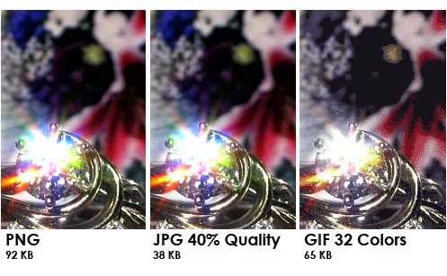
In regards to image formats for web, the most common ones are GIF, JPEG and PNG as they all offer compression to shrink a final image in preparation for download. Each format uses different colour models, forms of compression and transparency effects.

Lossless compression preserves all detail whereas Lossy compression sacrifices detail to make the file as small as it can be. Colour depth refers to the number of colours an image format contains. Colour depth is measured in bits- a higher bit value offers a higher total cloud count. An 8-bit colour depth is limited to 256 colours whereas a 24-bit colour depth can go over 16million colour options.

"What's The Difference Between JPEG, PNG and GIF?"
sultanrana (2013) "What's The Difference Between JPEG, PNG and GIF?" [Weblog] Technology Tutorials 13th February Available from http://sultanrana.wordpress.com/2013/02/13/whats-the-difference-between-jpg-png-and-gif/ (Accessed 25th November 2013)
GIF stands for Graphic Interchange Format and are files which are usually small and can be used cross-platform thereby making it versatile. They are most appropriate for images which have flat colour and hard edges or when transparency or animation is required. It uses a lossless compression format which is best suited to large areas of flat colour. GIFs are indexed colour images as the colour depth in a GIF file supports no more than 256 colours in one image which limits its use to compressing only a few colours. It is possible to save images with a large amount of colour information as a GIF however this would compromise the image quality.

JPEG stands for Joint Photographic Experts Group and works best for photographs or images with smooth colour blends. It has a high 24-bit colour depth which is well suited to photographs and colourful detailed imagery as it has the capability of displaying millions of different colours. JPEG's use lossy compression which means that detail is discarded for a smaller file size yet this is usually not noticeable for most images at most compression levels. However, the more you compress an image, the more the image quality suffers. Despite this, if an image has been compressed with high levels of JPEG compression, you can sometimes see blotches and squares which are referred to as artifacts. JPEG's need to be decompressed before they are displayed as it takes a web browser longer to decode and assemble a JPEG then a GIF.

PNG stands for Portable Network Graphic and these files can contain any image type and are often used as a substitute for GIFs. The reason for this is because they offer 2 modes of colour storage and have a large 24-bit colour depth so, even though they are lossless, they preserve all the colour and detail information. They can contain images with transparency or particle transparency as they have 2  mode of transparency, 1-bit and 8-bit.
"Choosing the Best Colour Format"
Robbins, J. N. (2007) "Learning Web Design", 3rd ed., California: O'Reilly Media, Inc., p371
So that the image is quick to download and is of a high quality, you need to make sure that you select the correct format for the image.

Hosting Fees:

For the pages of a website to be on the internet, they must be on a web server. Some desktop computers have software for this but otherwise, you would have to rent some space on a server. This is called finding a host site.

A hosting service is where individuals and companies can make their own website and businesses can rent space for them to have them put on the internet. Their service usually encompasses the technology and technical support necessary to maintain a running website. There are many different types of hosting services available:

Shared Hosting:

A hosting environment where server space is shared between your website and others, including the space and the software used. This is a more affordable option because the space is shared out amongst your website and other people but it can be slower to use.

Dedicated Hosting:

This is where you have the entire server to yourself which allows for faster performance as you are not sharing with anybody. You will be responsible for the cost of the entire server but this is a good choice for a large website which requires  a lot of system resources and higher levels of security

Collocated Hosting:

Where you purchase your own server and have it housed at a web hosts facilities but makes you responsible for the server. The advantage to this is that it can make you be in full control of the server so that you can install any programmes, applications or scripts you need.

Free Hosting:

Some companies, however, do give away some space for free but the downside is that you would not have your own domain name and it will have their advertising on them. There are options of free hosting sites such as setting up blogs or using social networking or online community sites. Despite this, connection can be slow and websites can go down frequently.

Advantages and Disadvantages when Designing in Coding Languages:

When designing for the web, there are 3 main types of coding which you are likely to come across: HTML, CSS and Java Script.


HTML within Dreamweaver
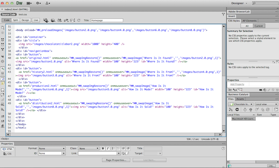
HTML stands for Hypertext Mark Up Language is a mark up language which is concerned with the presentation of a website and not the programming. It uses tags to structure the siteThe code is received by the user's computer and deciphered by browser software so that the formatted documents can be displayed by the browser that renders the page on screen. Images, Flash animation and other content are received and rendered as part of this process. The advantage of HTML is that it is a free language conceived by users for users and can be read by any type of computer with the same end result. However, the disadvantages are that web pages are stored on several files and designs are limited in what they can produce. 


CSS Style Sheet within Dreamweaver
CSS stands for Cascading Style Sheet and is used for specifying layout and style properties of a website. It allows a multiple of web characteristics to be applied to one particular website, such as fonts, colours and rollover effects, and keeps all the information in one place. CSS are usually embedded into HTML code and an advantage of CSS is that it is easily editable so changes can be made from the style sheet alone and it will automatically change the website. This gives the designer more control over the aesthetic of their website as it is much easier to maintain. However a disadvantage is that not all browsers are compatible with CSS so the information can be interpreted differently on different computers.


Java Script within Dreamweaver
Java Script is a programming, interpretive scripting language which deals with producing functions that have been written into HTML code. The information is usually executed on the user's server so it saves on bandwidth making it cheaper to run. Another advantage to Java is that it can be developed by third-parties so add-ons can be made so as to improve the functionality of a particular site. A downside to using Java is that it can be used to exploit a system and therefore poses security issues.

Screen Sizes:

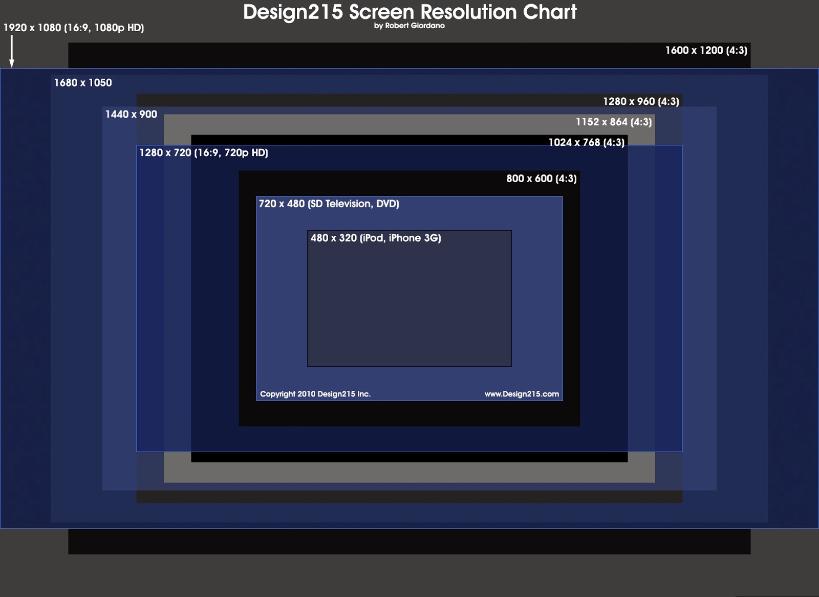
The screen size of something is the physical size of an area where an pictures and video is displayed. The size of a screen is usually dictated by the diagonal length of a screen when measured from opposing corners. This is different to display resolution which refers to the amount of distinctive pixels in each dimensions.
"Screen Resolutions Chart" by Robert Giordano
Design215 (2010) "Screen Resolutions Chart" [Internet] Available from http://www.design215.com/toolbox/screen_resolutions.php (Accessed 25th November 2013) 
When designing for web, the main commercial web designs were made to fit a 800 x 600 pixel computer monitor which is the smallest significant monitor still in use but with the introduction of wide-screen, like iMac, there has been a change of making web pages 1024 x 768 pixel in width on average for high resolution monitors.

Despite the typical intention of designing for a set size, it is especially important to consider designing for a range of formats due to the range of screen sizes and formats available. When a layout for a website changes in regard to the format it is being viewed on, this is known as Responsive Design.

"The Baker Street Enquirer" by Ethan Marcotte
Kayla Knight (2011) "Responsive Web Design: What Is It and How To Use It?" [Internet] Available from http://coding.smashingmagazine.com/2011/01/12/guidelines-for-responsive-web-design/ (Accessed 25th November 2013)
The idea of Responsive design is to make the web page flexible so that it works in any size and format, particularly as many platforms can change from landscape to portrait instantly. This can be manipulated through the use of images and grids to make it easier to scale down the information so it works on a large range of platforms, sizes and formats.

Usability and Navigation Conventions:

For a website to be useable to the wider audience, the website needs to be simple. There are many ways in which you can add this to your website design through these considerations.
Navigation and Links between PagesCameron Chapman (2010) "Information Architecture 101: Techniques and Best Practises" [Internet] Available from http://sixrevisions.com/usabilityaccessibility/information-architecture-101-techniques-and-best-practices/ (Accessed 25th November 2013)
A great website is consistent by having the navigation bar and page links in the same place on every page. By moving your navigation, it will confuse the user so they will go to a different site to find the information they want.

By having all links and tabs clearly marked throughout the website, it will allow for visitors to easily navigate their way around the website. This goes for the use of icons in websites as well- if the buttons image doesn't need explaining then it is clear. The use of breadcrumbs might be ideal so that the user can see where they have been and where they may go next.

For button functionality, make sure all of the buttons work in the same way and have an intuitive reaction to when the cursor is placed on them so that the user knows it has been selected. You need to make sure that all the button links work when the website is produced and the buttons need to stand out so that the user knows that it is one of the website features.

A lot of websites run of a visual hierarchy where the most important information is at the top of the site and the least important near the bottom. This gives automatic processing of information for the visitor as users will know where to go. In regards to content, the use of headings and sub-headings is ideal so that all the information is set out in a structured and organised way which is easy to find.

Content Management of Files:

There are two ways in which content management can be interpreted when it comes to web design and this is based on whether your website is hand-coded or if you are someone who does't know how to program.
Content Management of files in Root Folder
When using hand coded web design in software like Dreamweaver, you need to manage the content of your website by having all of your content in a folder called the Root Folder. Within that folder should be all of your pages in files. Within the Root Folder, you should have a separate other folder called Images which contains all of the images for the website inside which keeps everything all together. This is so that the server can find all of the necessary files and images for the website when it is online which makes it quicker to download.

If you are not able to code websites, Content Management Systems can be used. Content Management Systems let non-technical web users be able to update their website content without using any HTML or code. This uses software that uses a database to manage and organise information. If a visitor makes a request on the website for particular information, the CMS will select the content and applies it tot he chosen interface template. This means that the software does a lot of the work for the user so people who don't know any coding are able to produce a custom made website.

References:

Shea, D. and Holzschlag, M. (2005) "The Zen of CSS Design" California: Peachpit Press

Robbins, J. N. (2007) "Learning Web Design", 3rd ed., California: O'Reilly Media, Inc.,

Weinman, L. (2003) "Designing Web Graphics. 4" 4th ed., Indiana: New Riders Publishing

Gordon, B. and Gordon, M. (2005) "The Complete Guide to Digital Graphic Design" 2nd ed., London: Thames & Hudson

Context of Practise 2: Lecture Notes- "Globalisation, Sustainability and the Media"

Thursday 21st November 2013
"Globalisation, Sustainability and the Media"
Richard Miles

Globalisation

  • Socialist- The process of transformation of local or regional phenomena into global ones. It can be described as a process by which the people of the world are unified by a single society and function together. This process is a combination of economic, technological, sociocultural and political forces.
  • Capitalist- The elimination of state-enforced restrictions on exchanges across borders and the increasingly integrated and complex global systems of production and exchange that has emerged as a result.

A by-product of markets expanding into second and third world countries- This has created a dominance of one particular culture over the rest of the world- Western Culture

"McDonaldization"
- Multi-layered complex culture
- How american big companies are taking over the globe
- A particular idea of life which is transposed all over the world- a forced model of society
  dominating
- The idea of a fragmented, disposable culture
- A job which you don't want to do but you have to do because there is nothing else to do- work
  doesn't become meaningful or fulfilling

"Understanding Media" Book (1964) by Marshall McLuhan
- Argued that telecommunication would have a huge effect on our society- bringing the world together

"A Sudden implosion has heightened human awareness of responsibility to an intense degree"
- Marshall McLuhan

- World has shrunk and become more interconnected - This is before the internet
- Rapidity of Communication echoes the senses
- We can experience instantly the effects of our actions on a global scale

The Internet
- These effects argued by McLuhan hasn't happened
- As a society, we are desensitised to this and are not sympathetic
- We are more separated than ever due to this technology
- Different cultures are realising that there values are being taken over
- Globalisation has reshaped our world in a more negative way

Jihad McWorld by Benjamin R. Barber
- Centripetal Forces- bringing the world together in uniform global society
- Centrifugal Forces- tearing the world apart in tribal wars
- Feel like there values are being destroyed and take over by the world

Three problems of Globalisation
- Sovereignty- Challenges to the idea of a nation-state
- Accountability- Transnational forces and organisations: who controls them?
                          - Having multinational companies means they are almost impossible to police
                          - Businesses are more powerful than Governments- the can act outside of this control
                          - Passing laws will do nothing
- Identity- Who are we?
               - Loss of identity due to this monoculture

"We are not moving towards a cultural rainbow that reflects the diversity of the worlds existing cultures. Rather, we are witnessing the rise of an increasing homogenised popular culture underwritten by a Western Culture Industry based in New York, Hollywood, London and Milan"

- Steger

Cultural Imperialism
- If the "Global Village" is run with a certain set of values then it would not be so much an integrated community as an assimilated one

"Rigging the "Free Market"
- Media Conglomerates operate as Oligopolies (Giant Clusters of Businesses all in the control by One Central Figure)
- Effectively, 6 companies are controlling the world's media, all of which are American
- These companies control the output of the worlds media- Internet, Magazines, Television
- Whatever you are reading, by proxy, you are taking an American take on the world
- There are 4 main targets by American Oligopolies- North America (Prime Market), Western Europe/Japan/Australia, Developing Countries and Tiger Countries, Then Rest of the World (As there isn’t as much money to be made there)


- Very slow, through the back door understanding on the culture where the values and ideas of 
  Amercian Capitalism gets spread. This is a slow force of indoctrination, making everyone else 
  believe that your way of life is the best way of life.
-    - Schiller- dominance of US driven commercial media forces US model of broadcasting onto the rest 
        of the world nbt also inculcates US style consumerism n societies that can ill afford it
-    - Big Brother- western cultural ideas re-packaged all over the world and specific to the culture they 
       are marketed at. Making money for the original source.
-    - Skin Whitening Cream in India- Perverse form of cultural assimilation

Chomsky & Herman (1998) "Manufacturing Consent" Book
- Argues that the in the media system is a form of propaganda for the way of western life
- Indoctrination effect of constantly being fed this through what you watch and read

- Propaganda Model (5 Basic Filters)

  • Ownership
  • Funding
  • Sourcing
  • Flak
  • Anti Communist Ideology

Ownership
- Large percentage of newspapers are owned by Rupert Murdock
- He has a particular political take on the world
- His agenda is to make as much money as possible
- His newspapers articles are very self-serving and will do anything to make their money
- These people have immense power- peoples political allegiance can be swayed by Newspapers

Sourcing
- The stuff that is reported is what is only allowed to be reported
- Looking out for there best interests

Funding
- Newspapers acting as businesses to make a profit
- Advertisers will withdraw funding if there adverts are not done properly
- Controls the information we get which is representative of big business

Flak
- Organisations which manipulate the news even further
- Lobby Groups or Media which spreads their take on the world
- Global Climate Coalition- Flak group to represent multinational Oil Companies
                                          - Get adverts and news in the newspapers while arresting protesters
                                            against- destroying voices of dissent and paint the oil company's in a great
                                            light

"Global warming is one of the biggest hoaxes ever perpetuated on the Amercian public"
- Jim Inhofe

"An Inconvenient Truth" (2006) by Al Gore and Davis Guggenheim
- Using the media to transform the way people think
- Dramatic way of getting the message across using scientific evidence
- To save the Planet:

  • Release less C02
  • Plant more Vegetation
  • Try to be c02 Neutral
  • Recycle
  • Buy a Hybrid Vehicle
  • Encourage everyone to watch this film

- The solution to the worlds problems is to save more stuff- more money for the big businesses

Sustainability
"The development that meets the needs of the present without compromising the ability of the future generations to meet this town needs"
- Brundtland Commission (1987)
- Needs (Particularly the World's Poor)
- Limitations of Technology
- Sustainable Capitalism

BIOX Power Plant in Canada
- an attempt to make a power plant that is sustainable using alternative ways to make alternative, 
  clean fuel
- Its renewable but it is more expensive to produce with less profit so this would never interest large 
  fuel companies

Greenwashing
- Exploiting the concerns of people being concerned about the environment
- A Green market to make it look more eco-friendly
- McDonalds have changed to Green so that they appeal to a new market
- You can now buy Eco to make yourself feel better

G20 Protests
- People are realising that this problem is being caused by the Governments and not by themselves

"Most things are not designed for the needs of the people but for the needs of the manufacturers to sell to the people"

- V. Papanek

Friday, 15 November 2013

Design for Print: Print Seminar 1

Print Seminar 1:
Chronologies of Print

Chronologies
- The sequential order in which past events occurred

Print
- To produce text or image by applying inked types, plates, blocks
- To reproduce by engraving on a Plate or Block
- By stamping with an engraved plate or block: to print Calico
- To cause a Manuscript text to be published in print

When something is printed, we see it as true or correct as it is always gong to be there despite the fact that it might not be. We take it as factual. You can print a retraction but that doesn't really rectify it.

A way of representing the time
- Drawing on walls as a photographic record
- A way of Documenting, Communicating and Reproducing

200AD Chinese Woodcut Typography
- Skill-based and is the earliest evidence of print we have
- Incredibly traditional and printed on fabric

1400AD Europe was Introduced to Printing

1650AD First Book produced in China was a Buddhist Religious Scripture
- Religion had money and the following of people making it a community. This made it a force of communication

2000AD Woodblock Colour Print
- Shows the evolution over the years

Knowledge is Power
Mass Communication

1000AD Movable Type in Asia became a Craft Skill

1450
- Guttenberg Press in Mainland Europe Renaissance Era
- Society became self-sustaining
- Literacy-based boom which allowed people to learn how to read and write.
- People with money learnt over the poor which caused a divide between the literate and illiterate
- Trickle down theory of Reading and Writing
- People became connected within nationalities and became cultural self-aware of the world around
  them

The output of printing materials in the 18th Century is 1 000 000 000
- Fuelled by countries who have a formalised religion

1500AD all of Europe have printing but UK doesn't get it tip 300 years later
- Scientific boom with own people putting their own ideas down
- Gutenberg Press made our world change from a spoken culture to a visual culture
- Hot Type/ Hot Lead Press leads to the production of Glyphs and Punctuation which were seen as
  pictures for text

Marshall McLuhn (1911- 1980) "Medium is the Message"
- Global Message- Community and Mass Communication
- Predicted the Internet 30 years before its Inception
- New technologies of languages changes how we cognitively deals with society
- Way our language evolves and develops quickly but type doesn't change
- The type of printing created Individualism, Democracy, Nationalism and Capitalism

LinoType Documentary
- Linotype revolutionised printing- comes out as one solid block of type
- Use to be called Line Casting and was popular around the late 1800's to 1960/70's
- Allowed for a smaller amount of people to work on a newspaper and could be changed daily

"The Three Crosses" by Rembrandt
- Earliest evidence of Etching and is part of the Intaglio family
- Fuelled by religious themes
- Mass communication was incapsulated

"Moulin Rouge- Lady's of the Night" Advertisement by Toulouse-Lautrec
- Lithography and hand-crafted type

William Morris
- Time of Excess- making everything look nice showing affluence- ornate decadence

1870- Colours coming through

Visual Tone and the use of Propaganda
- Very Patriotic and casual approach to war
- Fighting and making it look cool- If its printed, its true, correct and factual
- How we have money controls the way we print

German Form within Propaganda
- Using imagery to get the point across as not everyone was literate
- Use of the 2 colour separation

Modernism (1930's)
- The style lends itself to Print
- Primary colours and solid imagery with a clean layout

The way print making dictates design which can determine the aesthetic and cost

Why Print is Dangerous (Case Study)
- Ran a lot of anti-Muslim Propaganda based on a war hero not getting the George's cross
- If its printed, it doesn't make it true

Shepard Fairey and Street Art in the 90's
- Use of Andre the Giant (WWE Wrestler) taking his image from a magazine and screen printing it
- His image was everywhere and became an icon, developing into the brand for Obey
- Same thing was done with Obama print- Connected with a youth who had never voted before
- Both of them became icons of propaganda in their own right

Thursday, 14 November 2013

Context of Practise 2: Lecture Notes- "Ethics- What is Good?"

Thursday 14th November 2013
"Ethics- What is Good?"
Richard Miles

Facts:
The assets of the worlds top 3 Billionaires are greater than 600million people
1/3 of people live on $2 a day
1.2 Billion live on $1 a day
Black Poverty is double that of White Poverty in America

Living in a fundamentally unjust society based on inequalities
- how can we exist within this system whilst holding up the ethics of society?
- equation of advertising being the cause alongside the rest of the worlds problems

"First Things First Manifesto" (1964) by Ken Garland:
- Signed by famous Creatives of the time
- Produced in the Boom time of post-war affluence and mass production
- Frustration of Creative Talents being wasted on marketing pointless, trivial commodities
- Call for Designers to do something more
- Celebration of the Designer but a sigh at the waste of Talent for this purpose
- Ethical turn as it is Unethical to waste talent for the profit of others and talent should be used for
  more wholehearted means

First Things First Manifesto (2000) by Adbusters: 
- Anti-Capitalist Magazine calling for abolishing of Consumer System hence the Name
- Political Group Journal
- Republish and Re-draft the original Manifesto
- Change of Tone of Voice- Critical and Venomous

"Advertising have persistently been presented to us as the most lucrative, effective and desirable use of our talents"
- Adbusters (2000)

- Designers should do the work which pays the most money and thats how our work is seen. This way of thinking is reinforced within the Design Schools.

"This, in turn, is how the world perceives Design. The profession's time and energy i sussed up manufacturing demand for things that are inessential at best"
- Adbusters (2000)

- We are all indoctrinated into a profession that makes people buy things they don't need with money
  they don't have- creatives are complicit with this exploitation and should be blamed for this as well
- Affecting the way people think and react towards each other

"Unprecedented environmental, social  and cultural crisis demand our attention"
- Adbusters (2000) 

- What do you determine as worth or unworthy?
- Tone becomes very preachy and dictoral as the Manifesto goes on
- If you work to market or brand companies who make any items, you are being UnEthical as you are
  perpetuating consumerism which is ultimately ruining the world.
- Designers should be challenging this and starting a revolution against this society- show your talent
  in this way by Culture Jamming/Meme Warfare

Meme:
- Is a Unit of Information that sticks in your head
- Circulating around the world virally

"Potent Memes can change minds, alter behaviour, catalyse collective mind shifts and transform cultures"
- Kalle Lasn of Adbusters

- This is not Ethical in its own right- a means to an end

- Just because you work for a certain company doesn't mean that you are unethical
- To be an ethical designer doesn't mean you have to be fundamentally anti-capitalist
- Rich, Successful Designers signed the original manifesto- It's ok to stick your nose up at others
  when you have money- Emerging Designers don't have the luxury of choosing who to work for and
  can't afford that choice.
- The system of Exploitation is what is Unethical, not the people who brand them or shop there
- To be an Ethical Designer is to do more with your life then just take a job

Design for the Real World (1971) by Victor Papanek:
- Argues the same as The First Things First
- Design is wasteful and exploitative- harming the world with their Designs rather than helping it
- The designers job should be to help others

"Most things are designed not for the needs of the people but for the needs of manufactures to sell to people"
- Victor Papanek (1971) 

- Conflating Advertisers with Capitalism
- There is a grander purpose for Creative Individuals- use skills to do something more important in
   the world

"Papanek Beer Can Automobile Can Bumper" (1971)
- Cost him 5 Dollars to make and drove it into the Senate Building
- Proving that a Company can make a car safe
- Poeple are ignoring Design Solutions for profit

"The Design Problem" Diagram
- Designers only deal with the ti[ of the iceberg making it aesthetically better whereas The Real
  Problems with the world are not being dealt with.
- There are more urgent things that need our attention that we could be solving

Ethical Theories on How do we Determine What is Good?

Subjective Relativism
- There are no universal moral norms of right and wrong
- All persons decide right or wrong for themselves
- This would cause the breakdown of Society

Cultural Relativism
- The Ethical Theory that whats right or wrong depends on place and/or time
- Society will have a series of shared values
- Not all Cultures are the same which will cause a clash of ideologies

Divine Command Theory
- Good actions are aligned with the Will off God
- Bad Actions are contrary to the Will of God
- The Holy Book helps make the decisions
- Not based on Reason

Kantianism:
- Immanuel Kant (1724- 1804) German Philosopher
- Peoples wills should be based on Morals
- Therefore its important that our actions are based on appropriate general moral rules
- To determine when a meal rule is appropriate Kant imposes 2 Categorical Imperatives. If followed
  and you answer these questions you can determine if its ethical or not. This is based on logic and not
  on emotion.

2 Catagorical Imperatives:
- Act only from moral rules that you can at the time universalise
(If you act on a moral rule that would cause problems if everyone followers it then your actions are not moral)
- Act so that you always treat both yourself and other people as ends in themselves, and never only as a means to an end
( If you use people for your own benefit that is not moral)
Adbusters is not ethical under this second definition as it is using Advertisers to make its point

Utilitarianism (John Stuart Mill):
Principle of Utility (AKAGreatest Happiness Principle)
- An action is right to the extent that it increases the total happiness of the affected parities
- An action is wrong if it decreases Happiness
- This is known as Consequentialism as you could do something wrong and it could make everybody
   happy
- Based on the use of your actions for society

- None of these are really workable and are all flawed as you are giving up your liberty for the good of everyone else

Social Contract Theory:
- Thomas Hobbes (1603-1679) and Jean- Jacques Rousseau (1712- 1778)
- An agreement between 2 individuals held together by common interest
- Avoids society degenerating into the 'state of nature' or the 'war of all against all'
- We trade some of our Liberty for a stable society
- Thinking about the common good rather than individual gain which is a good way to formulate ethics

Whether presented with Problems that are easy or difficult to solve, the 4 workable theories could provide us with possible solutions to many of the problems in the First Things First manifesto

Criteria for a Workable Ethic Theory:
- Moral decisions and rules
- Based on Logical reasoning
- Comes from facts and commonly held or shared values
- Culturally Neutral
- Treat Everyone the Same

AIMING FOR SOCIALLY AND ECOLOGICALLY RESPONSIBLE DESIGN

Design for the Real World (1971) by Victor Papanek
- Social Tithe- The Model for Ethical Practise
- Tithe is something that you give away from free
- Something that you give up for the common good of society
- 10% of our time should be given to worthwhile ethical causes like Pro Bono or Ethical Causes or
  Charities
- If everyone did this, the world would be improved and would benefit everyone
- More productive manner for changing the world whilst living within this System

Wednesday, 13 November 2013

Design for Print Seminar: Print Formats and Finishes

Print Formats and Print Finishes:

Coated
- UV Violet Coating- can be applied on spot locations of the paper or by flooding the page
- Produces sharper, clear images
- Paper has been coated in a compound to make qualities of the paper better, such as the weight, strength, smoothness and ink absorbency

Uncoated
- There are various textured options available
- Uncoated papers are usually surface-sized to improve their strength

Coated v Uncoated:
  • Coated has a shimmer and feels smooth
  • Uncoated appears matt and will feel rougher and grainier. Won't produce a crisp image due to the grain
  • Coated is like a pane of glass whereas Uncoated is like a sponge. 
  • Painted coated papers appear bright and colourful
Die Cut
- generating a large shape from the material. Way of making a hole in the paper

Emboss/DeBoss
- Emboss is to raise the image but DeBoss pushes the image down

Laminate
- Creating corrugated board that has a high quality, lifo surface.
- There are 3 different types: Inline, Offline and Sheet to Sheet
- Process of coating a prated page with a protective plastic foil

Duplex
- Printing on both sides of the paper on Multifunctional Printers

Foiling
- Application of pigment and metallic foil. Adheres to the paper by heat and die on the surface of the paper

Spot Ink
- A colour which isn't within the standard CMYK colours, such as a metallic or fluorescent ink.
- When using just as single colour, this can make for a cheaper run but if this is added to a full-colour run, this can become a very expressive colour run
- They are used to prevent forgeries of money and passports
- The production of spot colours has produced a range of spot colour classifications and systems, like Pantone, Toyo (Japan), ANPA (American newspaper Association) and RAL (Europe)

Metallic Ink
- A combination of a Pantone Colour pigment mixed with particles of a metallic compound
- These Inks are opaque and require a different ink/water balance than other ink types
- The harder and less porous the substrate surface, the more metallic the ink will appear
- The smaller the particle, the less shiny effect of the ink

Thermo
- Commonly known as 'poor man's die-stamping'
- Raises an image similar to Engraving/Embossing
- Doesn't produce an image which is as sharp or as intense in colour

Study Task:

With a focus on Stock, Substrate and special Print Finishes, find as many variants as possible for each of the following areas of Design:
  • Branding and Identity
  • Packaging and Promotion
  • Publishing and Editorial
  • Information And Way Finding
Aim to try and collect as many physical/actual examples of Print as you can find so you can comment on the tactile, format and function of each example and evaluate it (Found).

Branding and Identity:


"Fieldwork Branding" (2013) by Fieldwork
Fieldwork (2013) "Fieldwork Branding" [Internet] Available from http://madebyfieldwork.com/work/fieldwork (Accessed 18th December 2013) 
Die-cut, Letterpress and GF Smith Stock: When making their own brand identity, Fieldwork made a wide range of printed collateral to go alongside the identity. They used Die-Cut to make the shape of the brand cut exactly out of the business card. A Letterpress was used to transfer the brand onto the stationary which had been duplexed onto expensive, quality GF Smith stock. This was evident when GF Smith visited the College and gave a Seminar on their products and stock which we go to try them for ourselves.


"Doctor Manzana" (2013) by +quespacio
+quespacio (2013) "Doctor Manzana" [Internet] Available from http://masquespacio.com/doctor-manzana-2/ (Accessed 18th December 2013)
Spot Colour: This brand encompasses a wide range of printed ephemera ranging from plastic to fabric to stationary and boxes. The choice of colours makes for an individual identity yet I would imagine it would be quite expensive to produce on a large scale due to the specific colours. 


Found: Criminal Damage Clothing Tags
Coated and Foiling: The coated thick stock makes for a soft yet reflective effect on the tag yet this reflectiveness adds to the shininess of the foiling that has been used on the tag for the detail. The metallic on the black makes for a classy, understated cool aesthetic which is the intention for the function of the tag as it is promoting the clothing and the brand itself. The 2 different sizes is appropriate as it makes sense to have a smaller tag for smaller pieces and a larger tag for large items and the square format is appropriate for the need to have information on the back.


"Fiasco Gelato Holiday Collection" (2013) by James Boettcher and Megan Zee
Boettcher, M and Zee, M. (2013) "Fiasco Gelato Holiday Collection" [Weblog] The Dieline Available from http://www.thedieline.com/blog/2013/12/20/fiasco-gelato-holiday-collection.html (Accessed 18th December 2013)
Spot Colour: The brand identity for Fiasco Gelato is highlighted more by the Spot Colour of a bright fluorescent blue which makes it different from other brands available but seems to provide an emphasise on the organicity and authenticity of the brand itself as well as reflecting the coldness of the product its selling.


"The Golden Camera 2014- Preview" (2013) by Paperlux
Paperlux (2013) "The Golden Camera 2014- Preview" [Weblog] The Behance Network 18th December Available from https://www.behance.net/gallery/THE-GOLDEN-CAMERA-2014-PREVIEW/13220977 (Accessed 18th December 2013) 
Spot Colour and Emboss- Beautiful invitations and identity for The Golden Camera Preview with the embossed aspects of the envelopes emphasizing the high quality and distinctiveness of the brand. This aura surrounding the quality is mirrored by the colour choices of the metallic gold spot ink and bold blue which gives it a royal theme. This works with the function of the brand as well as the fact that the emboss elements works with the tactility that is promoted by the designer which means that it promotes both the client and the skills of the design studio.


Found: Paul's Boutique Labels
Spot Ink: The use of the metallic spot ink for the Paul's Boutique brand makes the brand comes across as quite brash which is mirrored with the use of bold print on the back of the label, adding to the function of promoting the label to a youngish audience. This larger label format mirrors the boldness of the brand itself yet the thickness of the card for the labels makes it sustainable to be placed in shops without breaking.

Packaging and Promotion:


Found: Castillo Real Tempranillo Wine
Spot Colour, Foiling and Stock: The Sticker packaging which is used for the bottle is quite thick with a cream, off-white stock which gives it the feel of being higher quality without taking away from the need of the sticker to be tactile so that it can easily wrap around the bottle. The foiling of the badge alongside the use of a Gold Metallic Ink which adds to the details of the sticker. The stickers function is to tell the drinker the details of the wine and the sticker manages this without taking away from the function of the bottle itself.


Found: Quality Street Chocolates
Foiling: The packaging for the sweets themselves is that they are wrapped up in coloured foils that have the brand name on them. This would be a different approach to foiling as usually foiling is putting foil on paper but the foil has been printed onto instead to create the effect of using it as a branded packaging option. This allows for a tactile packaging that can fit around different shapes and sizes and can be easily got rid of when it has completed its function due to the malleable nature of the foil therefore making it a thoughtful choice of packaging option.


"Two Sisters Photography" (2013) by Fizz Creative
Fizz Creative (2013) "Two Sisters Photography" [Internet] Available from http://www.behance.net/gallery/Two-Sisters-Photography/9213553 (Accessed 17th November 2013)
Die Cut: This letterpress printed business card is unusual and bespoke based on the Die Cut shape that has been produced to give it a classy, vintage look to go alongside the traditional portrait heads.


Found: Avenged Sevenfold Coasters
Uncoated Stock and Die Cut: These coasters I found are Uncoated so they have a grainy texture which works quite well when it is trying to keep a glass from moving as a glossy, coated stock wouldn't be able to achieve this. This texture goes well with the brown aged appearance of the coasters and this is produced in shape by Die Cutting into a typical circle coaster shape.


Found: Trivium Coaster
Die Cut: Unlike the previous textured coasters, this coaster is also cut into a circular shape by Die Cutting but it is of a more glossy coating. This isn't as effective as a product compared to the other coasters as it doesn't feel as good a quality of stock.


"Meadowlark Jewelry" (2013) by Claire Hammon at Meadowlark 
Sanchez, J. (2013) "Meadowlark Jewelry" [Weblog] The Dieline 12th November Available from http://www.thedieline.com/blog/2013/12/11/meadowlark-jewelry.html?SSScrollPosition=338 (Accessed 18th December 2013)
Spot Colour: The use of the screen-printed Silver Metallic Ink spot colour onto the boxes and fabric adds a heightened sense of quality and expense onto the packaging therefore translating to the clientele as being a brand of luxury and exclusivity.


Found: Creams Tearoom Packaging
Foiling, Emboss and Coated: I have visited these Tearooms and the brand comes across as being very traditional and old-fashioned which comes across in the choose of a violet pastel shade using a coated stock to have a shiny sheen to the stock. The stock itself is functional and strong enough to hold a few cakes inside without loosing its shape. The raising of the cafe name on the packaging for the cakes they sell adds to the quality and exclusive the brand is after which is only emphasised by the gold foil print.


"My Physical Portfolio" (2011) by Rowan Toselli
Toselli, R. (2011) "My Physical Portfolio" [Weblog] The Behance Network 19th January Available from http://www.behance.net/gallery/My-physical-portfolio/922635 (Accessed 18th December 2013)
Lasercut, Die Cut and Wood Stock- The designs have been Lasercut into die-cut wood to give a precise, professional finish onto an unforgiving and naturally difficult material to work with. The stock itself gives an environmental feel which adds to the physicality of the portfolio itself as well as highlighting the area of work the designer is in, adding to the promotional aspect of the work as it highlights the skills of the designer.


"Strange Xmas" (2013) by Stranger & Stranger 
Pfrang, J. (2013) "Stranger Xmas" [Weblog The Dieline Available from http://www.thedieline.com/blog/2013/12/20/stranger-xmas.html (Accessed 18th December 2013) 
Wood/ Fabric Stock and Diecut- The wood and fabric stock packaging gives a physical aspect to the promotional gifts, reflecting the aged aesthetic of the brand. The labels on the material packaging are die-cut to appear like leather stamps which, this format, adds to the worn aesthetic.


Found: Body Shop Christmas Gift Set Packaging
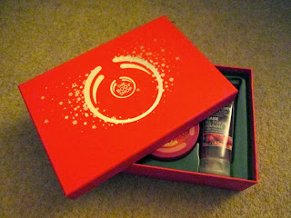
Coated, Foiling, Metallic Ink and Recyclable Stock: The Recyclable stock is coated to give a smooth, soft finish to the box itself. The Metallic Ink and Foiling used from the imagery on the front surrounding the brand logo is made to emphasise the festive nature of the gift, with the shiny effect encouraging the buyer that it would be a great gift for someone for Christmas.

Publishing and Editorial:


Found: Copy of The Metro Newspaper
Newsprint Stock: The stock used for the newspaper is Newsprint which is quite a thin stock to use yet this means that it is light and durable for its function. It will also mean that it is quite cheap to print due to the thinness of the stock choice which is relevant as it will probably be read once and then never used again.


"Fedrigoni Product Guide and Price List" (2013) by designlsc
designlsc (2013) "Fedrigoni Product Guide and Price List" [Internet] Available from http://designlsc.com/index.php/fedrigoni--product-guide/(Accessed 18th December 2013)
Mixed Stocks: This Publication for the paper merchant Fedrigoni uses a wide range of their paper stocks and boards with different thicknesses, print processes and textures to be able to advertise and display how there papers work to their large range of clientele so they can see for themselves what the paper would print like before choosing a stock to purchase and print on. This was evident when they visited the College and gave a Seminar on their products and stock where we go to try them for ourselves.


Found: My O'Neill Publication
Foiling, DeBoss & Uncoated: This publication I sourced by O'Neill uses an uncoated paper stock which gives it a real feeling of organic authenticity and works well with the brand ethics. The foiling and debossing gives an additional high quality to the publication as it makes it appear more up-market.

Information and Way Finding:


Found: My Foundation Certificates
Metallic Ink, Foiling & Coated: I found my Foundation Certificates which comes across as being official and of importance based on the fact that it uses a coated paper that uses a Bronzed- coloured Metallic Spot ink. To embellish this further, a Gold Foiling is used for a coat of arms to officiate the document thereby adhering to the function and formality of the document.


"Infographic Diary" (2013) by Maria Puche
Puche, M (2013) "Infographic Diary" [Weblog] The Behance Network 27th November Available from http://www.behance.net/gallery/Infographic-Diary/12448889 (Accessed 18th December 2013)
Binding: The main Finishing for the Diary is the use of the Japanese Stab Binding in order to put the thick pages together in an orderly fashion, keeping the pages together so the book can function. The binding gives the book a physical, personal edge due to the hand-made element of the binding.


"For Future Reference" (2013) by Mothership
Mothership (2013) "For Future Reference" [Weblog] The Behance Network 25th June Available from http://www.behance.net/gallery/For-Future-Reference/9496955 (Accessed 21st December 2013) 
Stock: The vinyl stickers and wooden stands for the signage works well with the rest of the exhibition space, with the function being that it is to guide the audience through the exhibition.


"Tesco Stores" (2012) by Mark Jenkinson
Jenkinson, M. (2012) "Tesco Stores" [Weblog] The Behance Network 2nd September Available from http://www.behance.net/gallery/Tesco-Stores/5011541 (Accessed 21st December 2013) 
Fabric Stock: The fabric stock that is used for the banners in Tesco helps to give the impression of being a traditional marketplace so it gives the idea of being a fresh supplier of food. the function of the banners are to orientate people as to the placement of particular food types and the use of fabric means that they can be easily taken down and moved when the store is re-merchendised.


"Leeds Market Re-Brand and Way Finding" (2012) by Sarah Roberts
Roberts, S (2012) "Leeds Market Re-Brand and Way Finding" [Weblog] The Behance Network 18th December Available from http://www.behance.net/gallery/Leeds-Market-Re-brand-and-Way-Finding/6367201(Accessed 21st December 2013)
Uncoated: The stock used for the map is off-white and uncoated which gives it a rough but organic feel. This format is then replicated by the paper-style packaging which gives a cheap yet traditional market aesthetic.
National Trust Location Map
Uncoated: The purpose of the map is to disclose where different Site are for visitors to visit whereas the quality of stock used is rough and quite flimsy but is folded into a much smaller format which is easy to carry around or put in the car.


"Amikuu" (2012) by AC Santos
Santos, AC. (2012) "Amikuu" [Weblog] The Behance Network 30th July Available from http://www.behance.net/gallery/Amikuu-archigraphy-and-way-finding/4676845 (Accessed 21st December 2013) 
Stock: The format of the information is provided in the style of a jungle adventure which is relevant to the function as it is aiding and giving information to the public for an attraction. The plastic is used to work in all weathers so it doesn't wear away and the information can be readable and legible.


"Southern Highlands Tourist Package" (2013) by Elki Lemmetty
Lemmetty, E. (2013) "Southern Highlands Tourist Package" [Weblog] The Behance Network 29th November Available from http://www.behance.net/gallery/Southern-Highlands-Tourism-Package/12514863 (Accessed 21st December 2013) 
Binding and Cardboard/ Wood Stock: The function of the threaded string made to bind together the labels and the t-shirts together in a fine package adds to the natural aesthetic given alongside the brown, cardboard-style stock. This cardboard stock goes well with the choice of wood to package the whole  information pack within this format.