For a source of inspiration, I went through all of the lectures that we had had and found several topics that I could go into.
 |
| Print Screens of Topics of Interest from the Lecture Programme |
 |
| Areas of Interest in the Topic of Hitchcock |
I decided that I wanted to look into is way of working, the motifs and themes that he would visit in his films and how successful his films actually were. Also, I felt it would be beneficial for me to look into his background to find out his influences and his lifestyle.
My first port of call was the library as I knew I could get a lot of detailed information from reliable sources.
 |
| Library Books Out |
 |
| Range of Hitchcock reference materials |
Bibliography:
Bordwell, D & Thompson, K (2008) "Film Art: An Introduction" 8th ed,. new York: McGraw-Hill
This book gave an easy introduction into film theory and the technical terminology used. It made me appreciate the doors that Hitchcock broke down in regards to experimenting with the technical aspects of film and how he pushed the boundaries for others to experience. The most important aspect which helped me which allowed me to visually see how film works is the use of stills which I intend to use to my advantage.
Chandler, C. (2005) "It's only a Movie: Alfred Hitchcock- A Personal Biography"New York: Simon & Schuster
The biography is amateur friendly, giving a chatty yet informative and friendly tone into the world of Hitchcock showing him as a person, his relationships and his approaches to film. The fact that Chandler knew Hitchcock means that the source is quite reliable and the interviews she conducts with not just him but those around him allows for a range of views on him, good and bad, making for her a reliable author. Out of all of the books, this one was of astounding help and gave me a great understanding of Hitchcock.
Deutelbaum, M. & Poague, L. (2009) "A Hitchcock reader" 2nd ed,. UK: Blackwell Publishing Ltd
This book was more of an analytical look into Hitchcock using essays and analysis that others have used and compiling them together. I didn't find it that helpful and found it difficult to read so I will only use it if I needed to find a quote or some further information and understanding
Duncan, P. (2003) "Alfred Hitchcock: Architect of Anxiety 1899- 1980" Koln: TASCHEN GmbH
This novel gave great background detail on Hitchcock's films, focusing on the works themselves rather than his personal life. The images to illustrate the comments made in the body copy visually provide an insight into the behind-the-scnees goings on within the films which puts you in the centre of the film studio alongside Hitchcock.
Hare, W (2007) "Hitchcock and the Methods of Suspense" USA: McFarland & Company Inc. Publishers
Similar to the 'Hitchcock's Motifs' book yet it focuses more on how aspects of his films were affected based on the need to create suspense. This takes arguments and comments from others and includes them as well as having separate sections that focus on just one aspect or gives examples. If I include a section on suspense then I will consult this book for added detail and depth.
Krohn, B. (2010) "Alfred Hitchcock" 2nd ed,. Paris: Cashiers du cinema Sarl
This was very similar to the "Architect of Anxiety' book yet it had less detail so I will probably use the other book as a reference rather than this one. It is good if you want a quick general overview which is helpful when your first looking into Hitchcock as it is quite an indepth subject so it was helpful int he beginning.
Walker, M. (2005) "Hitchcock's Motifs" Amsterdam: Amsterdam University Press
This anthology into just a number of Hitchcock's motifs was a very interesting read as it gives a number of accounts into the meaning behind his motifs and the ways they are introduced within his films as precursors. This helped shed new light into the purpose of his motifs and allowed me to think deeper behind the directorial choices of his films.
I made some notes based on the information that I learnt to record key information that I felt would be necessary to include within my publication.
The next thing I felt would be helpful was to actually watch some of his films which would give me some source material to work with. I felt that reading the books first gave me something to work with so that I wasn't looking just at the films and not knowing what to look for- I would be able to point out motifs and aspects of importance.I made some notes based on the information that I learnt to record key information that I felt would be necessary to include within my publication.
 |
| Double Spread Notes Page with areas of Interest for Publication |
 |
| Notes made from the books |
The main films I watched were Psycho and Vertigo as they are the most well-known so I wanted to be able to see why they are the most accessible Hitchcock films which have a more mainstream, mass-audience. I found what made them similar is that they use scenes which are fast paced and quick to produce a big impact to the audience. Using the technique of the film stills, I read about, I decided to record them in this manner.
 |
| Film Stills from Psycho Shower Scene |
 |
| Film Stills from Vertigo Tower Scene |
cannonb17 (2012) "Psychology of Hitchcock" [Youtube] Available from http://www.youtube.com/playlist?list=PL1E26CD35E026078F(Accessed 2nd April 2013)
What I did want to do was be able to have a comparison between Hitchcock's films and other films which he has influenced. I want to be able to connect to the audience and I feel as though I would be able to get the audience to interact with my product by having some of the contents recognisable to them.
 |
| 'Dial M For Murder' (1954) and 'Midnight Lace' (1960) |
The plot (the stalking of a young woman via the telephone by somebody who knows her) and visuals, such as the characterisation of the actors are distinctly similar, with Midnight Lace mirroring Dial M for Murder, as well as the themes throughout the films. The suspense behind finding out the culprit adds to the thrill of the films.
 |
| 'Shadow of a Doubt' (1943) and 'Stoker' (2013) |
 |
| 'Psycho' (1960) and 'High Anxiety' (1977) |
 |
| 'Vertigo' (1958) and 'Obsession' (1976) |
I thought that it would be beneficial to gain some inspiration from other designers who have produced publications of their own about Alfred Hitchcock in order for me to get some inspiration of my own.
After the unsuccessful Crit I had, I went onto looking at Hitchcock posters and how people have interpreted him and his work. I was recommended to have a look at the traditional posters first so that I could see the way it was laid out and the visual influence they had.
 |
Miscellaneous Hitchcock Posters
Misc. (2013) "Hitchcock" [Internet] Available from http://www.cinemasterpieces.com/cine_H.htm#hitch (Accessed 23rd April 2013)
|
A fantastic resource for traditional, vintage posters was Cinemasterpeices which has a wide range of vintage posters for famous films on sale. It allowed me to view not just one poster but several posters for one film therefore giving me a range to compare and contrast.What I noticed about the posters was firstly, the bold colour schemes. The use of stark, bold colours reflects the Technicolor of the more modern Hitchcock films with the use of filters to produce a coloured image from the black and white so that it has more of a visual impact on the audience. It seems to stick to being the primary colours with white and black overall. Another thing I noticed was the boxed, considered layouts with the use of rectangles and columns to mark all of the information and design out- It's very linear and sectioned off. One more thing is the constant use of capitalisation for the information on the poster, particularly for the Header in the shape of the film title which is usually accompanied by Hitchcock's name above it.
From this, I wanted to find some more modern, contemporary design inspiration which reflects the way that people have interpreted Hitchcock's films today.
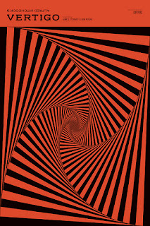
The difference between the modern and the traditional is the use of illustration and more creative imagery rather than using photographs. The use of information is shown via the visual image rather than the need to include text and the work is pretty much centred, without boxing off of the use of columns. Another difference is the use of black and dark colours which completely contrasts from the bright colour schemes of the traditional as they focus more on the horror aspects of the plots of the films.
I think that when I produce an aesthetic for my poster designs, I want to be able to bring together a mixture of the traditional and the contemporary so as to create an aesthetic that works which keeps them together.
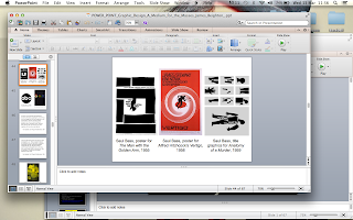
In a celebration of the graphic design of Saul Bass, renown for his Hitchcock posters and movie title sequences, Google produced a video on the date of his birth to celebrates his work.
 |
| Stills From The Google Doodle |
Saul Bass Tribute Google Doodle Video
Google Doodle (2013) "Saul Bass" [Internet] Originally uploaded to Google Homepage but Available from https://www.youtube.com/watch?v=4MK09vd_YG0 (Accessed 8th May 2013)
I felt that this was a very clever tribute which takes influence from many of the Hitchcock films that he produced. Hitchcock films included within the animation involve North By Northwest, Vertigo and Psycho. It takes on the quirky and disjointed aesthetic and parodies it but in a fitting and respectful manner which reflects how influential his work was.


.jpg)


No comments:
Post a Comment