- Branding and Identity
- Packaging and Promotion
- Publishing and Editorial
- Information and Way Finding
We need to identify the commercial/ cultural references, target audiences and creative context of the design works.
Branding and Identity
The way that this design is effective is that the screen printing and the choice of stock and layout makes for a very simple, understated yet elegant cafe brand. The target audience is social people who like to meet with friends, with the collateral giving the impression that the cafe is somewhere to relax and socialise.
 |
"Milanezza" (2013) by Paola Diaz
Diaz, P. (2013) "Milanezza" [Weblog] The Behance Network 2nd August Available from https://www.behance.net/gallery/Milanezza/10171421 (Accessed 9th October 2013)
|
 |
| Abandon Ship Clothing Label and Sticker |
 |
"The Cheese Shop" (2013) by Charlotte Littlehales
Littlehales, C. (2013) "The Cheese Shop" [Weblog] The Behance Network 8th April Available from http://www.behance.net/gallery/The-Cheese-Shop/7855587 (Accessed 9th October 2013)
|
 |
| Killstar Clothing Label |
 |
| Hype Clothing Label |
The screen printed element of the logo gives a simple presentation due to the fact that it looks like it has been digitally printed instead and shows how the clothing brand is understated and clean, appealing to fashionistas who will appreciate the self-assurance of the label. It is the subtly of the screen printing that makes it such effective design.
Packaging and Promotion
 |
"JUNGHOLZ Kopfhorer" (2013) by Kristina Duver
Duver, K. (2013) "JUNGHOLZ Kopfhorer" [Weblog] The Behance Network 2nd September Available from http://www.behance.net/gallery/JUNGHOLZ-Kopfhoerer/10695327 (Accessed 9th October 2013)
|
 |
| Chester Zoo Bag |
This paper bag has been screen printed using just one colour and the material has been chosen to be reusable and recycled so that it is overall, better for the environment. This print is effective because the design and the context of being at a zoo plays on the emotions of the zoo goers by showing how the animals need there planet and the encourages them to think about there actions in regards to the planet.
 |
"Oak and Finch Packaging" (2012) by Marco Stoermer
Stoermer, M. (2012) "Oak and Finch Packaging" [Internet] Available from http://www.marcostoermer.com/OAK-FINCH (Accessed 9th October 2013)
|
 |
| Nike Cardboard Shoebox |
The reason this is effective use of print is that the box is completely printed all over with the brand logo thereby acting as a form of clever promotional material for the company, attracting more and more consumers with the eye-catching large logo and bright red box.
 |
"Wondermade Marshmellow Packaging' (2012) by The Heads Of State
The Heads Of State (2012) "Wondermade Marshmellow Packaging" [Internet] Available from http://theheadsofstate.com/site/detail/wondermade (Accessed 9th October 2013)
|
 |
"Bachelor Thesis" (2013) by Cecilia Longa
Longa, C. (2013) "Bachelor Thesis" [Weblog] The Behance Network 8th September Available from https://www.behance.net/gallery/Bachelor-thesis/10774645 (Accessed 9th October 2013)
|
The thesis shows a range of print theory by having a mixture of black and white, mixed colour and full colour pages showing how print can be manipulated and experimented with. This is effective print design as it is hand-bound giving a physical, personal quality to the presentation of the thesis so that the target audience of the designers tutors will be able to see the effort and theory that has gone into the production of the thesis.
 |
| A Chocolate Story Attraction Publication |
This is effective design as it has been digitally printed on glossy paper and cheaply bound so that it can be quickly and cheaply reproduced to sell at a large amount of tourists to make a profit.
 |
"Publishing and Editorial Design- ODM" (2011) by ANY MTZ
ANY MTZ (2011) "Publishing and Editorial Design- ODM" [Weblog] The Behance Network 15th June Available from https://www.behance.net/gallery/Publishing-Editorial-Design_ODM/1626595 (Accessed 9th October 2013)
|
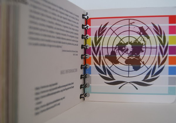
This use of hard covers as stock makes for a very stoic approach to publication design. Due to this choice, it has had to be ring bound to be able to be strong enough to hold the book together. Saying that, it makes for a strong publication which can be passed from customer to customer and last constant use for the company.
What makes this effective and creative print is that the design and presentation of the information reflects the tone of voice of a fashion week. The gradients of the monochrome design is beautifully executed and the fact it has been digitally printed reflects the fast turn-around needed within the fashion industry and its followers.
 |
"Graduate Fashion Week 2013" (2013) By Candy Black
Black, C. (2013) "Graduate Fashion Week 2013" [Weblog] The Behance Network 5th August Available from https://www.behance.net/gallery/Graduate-Fashion-Week-2013/10225589 (Accessed 9th October 2013)
|
 |
"Steven King Book Covers" (2011) by Sam DeMastrie
DeMastrie, D. (2011) "Stephen King Book Covers" [Weblog] The Behance Network 28th May Available from https://www.behance.net/gallery/Stephen-King-Book-Covers/1516007 (Accessed 9th October 2013)
|
These horror books covers are creative but are effective in the way that they have been packaged in a printed box that opens up and is shaped like a jaw which would instantly appeal to Stephen King readers, especially those who would be collectors or special editions.
Information and Way Finding
Information and Way Finding
 |
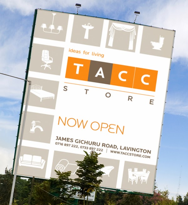
"TACC Store Identity and Branding" (2013) by Trushar Shah
Shah. T. (2013) "TACC Store Identity and Branding" [Weblog] The Behance Network 31st March Available from http://www.behance.net/gallery/TACC-Store-Identity-Branding/7897625 (Accessed 9th October 2013)
|
The main reason why this is effective print is because it is everywhere, advertising the shop and targeting consumers to visit its shop. It is effective as it is consistent throughout to reflect the brand of the company so it is instantly recognisable for the public, contextualising the methods of signage.
 |
| Chester Zoo Map |
 |
"Fedrigoni 2011 Calendar" (2011) by Paul Betowski
Betowitz, P. (2011) "Fedrigoni 2011 Calendar" [Weblog] The Behance Network 14th February Available from http://www.behance.net/gallery/Fedrigoni-2011-Calendar/973621 (Accessed 9th October 2013)
|
The monthly calendar acts like the traditional Russian doll where one box can be packaged into another, making for a compact design that gets smaller and smaller every month which is effective packaging. This would target graphic designers who would appreciate the stock and the concept. The print quality of die-cutting the name of the month out of each box allows for a glimpse into the next month and shows the next colour through the cutting.
 |
| National Trust Map |
This map of all the National Trust sites in the UK is to try and encourage people to visit them all or at least showing that there is a site near all of us. The thin paper stock makes the map lightweight to carry around in the car or on your person and the size emphasises the scale of the operation.
 |
"Bahamas Letterpress Wedding" (2010) by Studio on Fire
Studio On Fire (2010) "Bahamas Letterpress Wedding" [Internet] Available from http://www.beastpieces.com/2010/01/bahamas-letterpress-wedding/ (Accessed 9th October 2013)
|


No comments:
Post a Comment