It was an idea to look into how information goes viral so that we would be able to see what techniques and areas we could go into to make our brief viral. I decided to look at some info-graphics which clearly demonstrated aspects to look into.
 |
"How Do Things Go Viral?" by PushON
The Feed "How Do Things Go Viral?" [Internet] Available from http://thefeed.pushon.co.uk/news/latest-news/how-do-things-go-viral/ (Accessed 23rd February 2013)
|
This tongue in cheek diagram shows how to balance the right amount of quality product with business savvy in order to have a successful viral campaign. It is integral that we focus on the right audience that we want to target and focus on influencing them through the most appropriate methods, which would, in our case, be through blogs and social media.
 |
Houghton, B (2011) "7 Ways To Help Your Marketing Message Go Viral" [Internet] Available from http://www.hypebot.com/hypebot/2011/10/7-ways-to-help-your-marketing-message-go-viral-infographic.html (Accessed 23rd February 2013)
The use of Graphs and Statistics as well as a clear visual picture helps the information get across. This infographic approaches the message from a business point of view as it looks at the long term approaches you can use which will continue to make your campaign relevant, such as making sequels and allowing the audience to have a voice.
|
Based on the fact that our idea is of producing our own design blog, it was imperative that we look into and visit as many as possible in order to see the different styles of blogs and layouts.
 |
| DesignWorkLife |
http://www.designworklife.com- DesignWorkLife is one of my personal favourite design blogs as it is constantly updated and has a wide-range of different types of graphics. It has special sections such as Type Love and has other designers have contributions which means that it has some structure as well as some spontaneity. I like the layout of the blog as it has a strong full description alongside a large amount of visuals which give a fulfilling amount of information on each post.
 |
| The Dieline |
http://www.thedieline.com- The Dieline is another one of my personal favourite blogs as it solely focuses on yet combines product and packaging. This focus means that it has a lot of good quality stuff and means that you can find product and packaging easily. The fact that it has it's own search engine with a large array of posts to choose from means that it has a large selection of design inspirations that you can find to suit the brief you are working from. I like the fact that it has a large image at the beginning of the article to draw you in and catch the audience's eye.
 |
| Design Week |
http://www.designweek.co.uk- Design Week mixes news articles with blog posts, surveys and job searches so it acts like a quality newspaper would with a wide range of reporting. This means that it doesn't just focus on providing inspiration which gives the blog a unique selling point. I like the design of the logo and the column based way that the blog is set out.
 |
| Creative Review |
http://www.creativereview.co.uk- Creative Review is a multi-disciplinary blog which gives a variation of information in the form of blogs, news articles, writer contributions and interviews that provide an insight into the industry. The fact that there is place for the user to write comments and contributions of their own keeps it interactive and allows for a bigger audience to be reached.
 |
| ilovetypography |
http://ilovetypography.com- ilovetypograhy, like The Dieline, is a specialist blog which focuses on the art of typography. It has features, such as Sunday Type, which include a large array of inspiration posts as well as interviews, articles and commentary of courses that could be taken to improve your skills. What I like about this blog is the personable commentary and the friendly tone of voice that the blog is written in.
 |
| Logo Design Love |
http://www.logodesignlove.com- Logo Design Love is another specialist blog but this is based on Logos, Brand and Identity. The fact that it gives an all-round view on every aspect of branding and identity means that it is a very well-informed blog. I like how it doesn't just focus on new design inspiration but also looks into the history and the inception of much of the well known brands of today.
 |
| Designer Daily |
http://www.designer-daily.com- What designer daily focuses on is mainly inspiration and commentary on up and coming design. What i like about it is the regular use of social media so that it can connect to its audience on another level.
From this research, as a group, we want to be able to have a strong identity so that we can stand out amongst this strong competition, with a visual appearance, constant content and consistent layout.
In regards to a visual appearance, for some primary research, I looked into some packaging and pill visuals from what I already had in the cupboard.
 |
| Pill and Vitamin Packaging |
As you can see, there is a large array of different types on the market with many of them using similar colours schemes, sticking to mainly a blue, yellow or green to give the boxes the appearance of being medicinal.
 |
| Plastic Vitamin Bottle Packaging |
I quite like the idea of using plastic boxes that could be opened or even having them with a label on and having a leaflet or a business card inside that could be given out. Maybe even having the leaflet or business card in a capsule or tablet shape to add to the format.
 |
| Consistency in Pill Packaging |
I like how these different types of pills are all kept together by having a uniformity amongst the packaging themselves whilst being individual to correspond to their ailment and cure.
 |
| Pill Packaging |
I went onto looking at the actual Pill/ Vitamins themselves. As a group, we want to incorporate some visuals on actual vitamins in order to identify with a corresponding type of design. This way, it would act as a logo in a sense for each separate design entity.
 |
| Selection of Pill/ Vitamin Types |
I managed to collect a nice array of different types. The pills/vitamins themselves seem to split themselves up into 3 categories based on the aesthetics that they present.
 |
| Natural Aesthetic |
One aesthetic they have is the appearance that they are natural which means that they are of a brown, beige or orange colouration with a more rounded or oval shaping. As a group, we are focusing more on this visual as it gives more of a supplement visual rather than a pill visual.
 |
| Synthetic Capsule Aesthetic |
The traditional aesthetic for pills is the idea of a capsule which I don't think we will be able to shy away from in order to produce a variation of visuals. The colour options are usually quite bright so that would give us some lee-way as to accounting for the use of a brighter selection of colours to consider for use.
 |
| Standard White Pill Aesthetic |
Another traditional aesthetic is the white pill used for paracetamol which has a distinctive shape that is easily recognisable to a global audience.
I think it would be ideal to have a mixture of all 3 in regards to the shapes in order to have a wide range and distinction between design choices. In regards to colour, it needs to be colourful but not saturated and bright otherwise it would take away from the content of the blog.
In regards to the idea of using vitamin supplements and medication within our imagery, I felt it was necessary to look into some design inspiration in regards to when this has been relevant to other work.
 |
"Build Your Own Capsule" by Capsugel
Capsugel "Build Your Own Capsule" [Internet] Available from http://capsugel.com/en/resources/build-your-own-capsule/ (Accessed 20th February 2013)
|
Capsugel is a company that gives you the opportunity to design your own pill/ vitamin capsule designs by allowing you to select Pantone colour schemes, type and even add company logos to produce your own customised branded pill capsule. The typeface is limited and the choice of colour palette is quite minimal, however, the idea is quite unique in the fact that it allows you to place consistency within a brand by including the idea of capsule design within the identity.
 |
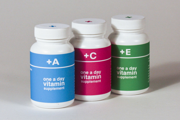
"Plus" (2013) by Jianna Liebermann
Lierbermann, J. (2013) "Plus" [Weblog] 30th January The Behance Network Available from http://www.behance.net/gallery/Plus-Vitamin-Packaging/6924459 (Accessed 20th February 20130 |
This approach to vitamin packaging has a strong audience that its identity is based around which is similar to ours: students. The use of using just letters and symbols instead of words as a name makes it appeal to its target market and makes the brand seem fresh, cool and young.
 |
"Sunshine Enema" by Jeremy and Erin Fortes
Bliss Is Ignorance "Sunshine Enema" [Internet] Available from http://blissisignorance.com/sunshine.html (Accessed 20th February 2013)
|
This product and packaging design for a Promo Release is consistent and thorough as it creates an identity for the band as well as makes them memorable for people who come across their music. The capsule and pill bottle are a protective alternative for the USB stick. Plus, the prescription receipt and the paper bag to hold them all in together continues the theme, making all the products united.
 |
"Super Skin" (2012) by Paul Capili
Capili, P. (2012) "Super Skin" [Internet] Available from http://www.paulcapili.com/#1 (Accessed 20th February 2013) |
This sunscreen is inspired by Marvel comic book heroes and the fact that there super powers usually come from medical experiments which have gone wrong, hence the capsule-esque reference within the shape. They are all the same to keep them uniform yet the colours are different to represent a different factor sunscreen.
Further on into the brief, I was given the job of doing the water bottle label designs. With this responsiblility, it was important for me to get some inspiration as to relevant water bottle designs so that I was well informed.
 |
"Vitamin Water Capsule Design" (2013) by Cindy Ng
Ng, C. "Vitamin Water Capsule Design" [Internet] Available from http://www.cindysng.com/projects/vitamin-water-capsule-design/ (Accessed 1st March 2013)
|
The bottles were designed in a rounded streamlined shape on the premise that the would take on the form of a capsule instead of a traditional bottle. This was so it was reflective of the brand itself as well as the intention behind the product which is to give the drinker added vitamins into their diet. The specific colours chosen are to represent the flavours that have already been put in place so the choices correspond to the brand identity of each one. The boxed packaging for the bottles is reminiscent of a first aid kit as it has been adorned by a cross which goes well with the health theme of the brand.
 |
"Tap The Cap" (2011) by Tap The Cap
Tap The Cap (2012) "Tap The Cap" [Internet] Available from http://www.tapthecap.com (Accessed 1st March 2013) |
Tap The Cap is a great piece of packaging design for water bottles as it is a water bottle top that universally fits onto any brand of water bottle so that it can be used by anybody. Vitamins are stored at the bottom of the cap and slowly released as the water is drunk so the consumer gets actual vitamin water rather than a sugar rush. The downside to the caps are that they can only be used once but this approach to packaging design is innovative and shows thinking outside of the box.
 |
"Vitamin Well" (2010 by Neumeister
Neumeister (2010) "Vitamin Well" [Internet] Available from http://neumeister.se/case/vitamin-well-3/ (Accessed 1st March 2013)
|
From the fact that it would probably most likely that I would produce just a bottle label for the packaging in order to keep the mass production prices down. Neumeister have produced a brand that aims to keep the labelling clear and as pure as the water that it contains. The structure to the layout of the design is precise and ordered with a clear typeface choice as well to mirror the design.