To show our understanding of the Context of Practise module, we have to produce a piece of work that shows an aspect of the module. Based on a interesting lecture given on the topic of Alfred Hitchcock, I decided to base it on him.
I produce an original concept board with just some initial possibilities that I could then expand into.
I felt that my concepts were quite vague and not focused enough yet the most successful idea I had from any initial concepts was the idea of packaging within a film reel canister. I knew that it would be difficult trying to locate a film canister so I knew I would have to do some looking.
I produced a rationale for my publication stating my intention in regards to what I am going to do and the audience that it is aimed at. I kept my answers quite broad as, at this point, I hadn't decided on a set idea.
Following on from the difficult, vague concepts that I had previously produced, I will use this idea of holding the book within this imagery and produce some more focused ideas based around this concept.
 |
| Idea Development Design Sheet |
I felt that these ideas were much more successful as they are more relevant to the subject matter without being over-complicated as well as being a lot more considered and focused. This made me feel much more positive about the brief and more excited. I want to use the one at the bottom which is having some fold out concertina pages within a feel canister which would appeal to movie collectors. The information would be quick and easy to digest as that would reflect that of the audience. From the imagery, I wanted to focus down the information I was using and how I would present it.
 |
| Design Development Sheet |
I want to have the pages look consistent throughout, albeit with some difference which will be based on the content of the pages so with this sheet, it gave me some considerations as to what to use in regards to visual representations.
After settling on the idea of having some concertina folding out pages that would come out of the movie reel, I started to look at page sizes.
 |
| Tester Folded Size Concertina's |
I tested the sizes of A6 and A7 as originally, when I made an A6 mock up, it looked to be maybe too big. I decided to go with the A7 size for now but based on the small amount of space, it may have to be changed later on.
I needed to decide on a colour scheme and a font scheme that I would use throughout. I wanted to maybe have 1 or 2 fonts considered so that I could have a header font and a body copy font maximum. I decided to test out typewriter fonts, roman fonts and block fonts.
 |
| Typefaces Considered |
Out of those which I tried, I had preference to 2 particular ones which were American Typewriter and Imprint MT Shadow.
 |
| Header and Body Copy Text |
I felt that American Typewriter suited the way that scripts would be typed out on a typewriter which gave it that vintage appearance. As for Imprint MT Shadow, I felt that it gave the visual aesthetic of the Hitchcockian suspense and thriller as well as looking quite classy and traditional.
 |
| Collaboration of Fonts Together |
For the title to be able to be put onto the publication, I want to have it on top of the film canister so that it looks like it has been stamped or printed on. The mixture of both fonts work well together and the rough edging gives the impression of it having been roughly stamped.
In regards to a colour scheme, Hitchcock mainly used muted, de-saturated colours whenever he did film in colour. Most of the time, however, he chose to film in black and white so I am going to look at both to see which I feel would be most appropriate.
 |
| Colour Scheme Variations |
The colour based schemes don't give the right impression or visual aesthetic that would normally be associated with Hitchcock. Despite the fact that they are quite muted, it doesn't give the same impression whereas the greyscale colour suits the tone of Hitchcock and his films.
 |
| Chosen Colour Scheme |
The greyscale is more fitting of the overall atmosphere and tone that Hitchcock uses within his films and this is what I want to replicate within my publication. This means it may be more difficult to produce but it would mean that it would be more faithful to the subject matter.
Throughout the publication, I want to have something that makes it consistent throughout and I like the idea of having the imagery of a film reel. With it being on the basis of my idea, I want to use it on the content itself as well.
 |
| Film Reel Illustration |
This basic illustration gives an image which can be reproduced easily in regards to making a visual that is easily recognisable and understood within the context.
 |
| Image Visualisation of Packaging |
This gave me the opportunity to visualise the impression of the physical object and how it could be presented.
I went onto producing possible layouts with the film reel imagery in order to produce some layouts that could work to put the content onto.
 |
| Possible Layout Designs Throughout |
I feel as though the ones that I was coming up with which were more complex were more appropriate as I feel as though the complexity reflects the personality of Hitchcock as well as the complexity of his films. Plus, it is a good representation of the technical complexity he delivers within his work.
I decided to test out these layouts in InDesign so as to see what it would be like in regards to text readability next to the designs.
 |
| Layout Background Designs |
I really like the use of the background designs alongside the content and images, particularly those of a lighter point size 0.25pt as it makes it lighter and more legible for the text. It makes the layout look a lot more interesting and give the layout more dimensions. I was worried about the readability of the text yet now I have tried it, it doesn't seem as problematic as first thought.
Based on the fact that the tester layouts I produced looked aesthetically good, I decided that I wanted to have some text and images on one side of the concertina, probably the front and then have some type of info-graphic or information visualisation on the back.
Biography:
I went onto producing a timeline for the biography which I wanted to produce using the continued imagery of the film reel.
 |
| Timeline Concepts Designs |
I tried the timeline as one side and also as a larger version using both sides of the concertina putting the writing on the bottom and to the side.
 |
| Layout Presentation Variations |
Out of these, I felt that the most successful was the halved timeline as the way that the information was applied was in a more unconventional manner.
From this, I went onto producing a front for the timeline where I wanted to include some family images and quotes directly about Hitchcock's personal life.
 |
| Testing Out Quote Layouts |
I wanted to have some surrealist way of laying out the quotes so that they had something more to them so i experimented with the way I could present the quotes.
 |
| Application of Text Layouts |
When singularly displayed, the swirled quotes are most appropriate and engaging visually, however, when put into practise, the square paragraph is more fitting. I placed the images within circles to go with the circular theme that seems to be going throughout.
 |
| Biography Front and Back |
I quite like the approach to the timeline which is a little bit different and I like the layout for the front. It seems to work as a visual set which makes it more interesting.
Motifs:
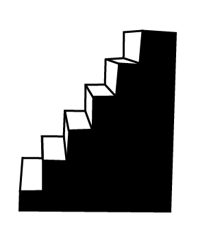
I wanted to do a info-graphic style visual to demonstrate the motifs that feature in Hitchcock's films.
 |
| Falling |
 |
| Staircases |
 |
| Cameos |
 |
| Voyeurism |
 |
| Homosexuality |
 |
| Blondes |
 |
| MacGuffin |
 |
| Corpse/ Death |
 |
| Light |
I tried to keep the pictograms as simple as possible whilst sticking to the black and white colour scheme and represented in the most simplest communicative form. I want them to be readable in both a large and small scale so that I would be able to present the information in a info-graphic style.
 |
| Front of Motif Page |
I decided that, with the layout being consistent, that I would use a similar use of information with having a small burst of the important facts in a short paragraph to aid consumption of the information to the target audience.
 |
| Graph Layout |
To make it relevant, I decided to produce a graph plotting where particular motifs occurred within the most popular films. I plotted the time in 30min points along the side and the films in year of release down the bottom.
 |
| Adding Pictograms to the Graph |
By plotting the pictograms, I felt that this was quite a successful way of producing a quick way of producing information as well as having a nice aesthetic.
We then had to give a presentation as to how far we had got with our project so far, what we were doing and what we were planning to do next. From that, we then had a crit based on the work. Mine didn't go very well and from that, I had to re-think and produce a whole new batch of work (See PPP Blog)
From the advice on the Crit, I went into researching again but looking at old Hitchcock film posters and the design work of Saul Bass. (See Design Context Blog)
I went into another Crit where I went to talk to my tutors about needing some direction as to where I was going. I gained some valuable advice in that Crit and it gave me a direction to go in (See PPP Blog)
From this, I decided to go with the idea of the film posters so that it works with the synthesis of the practical and the theoretical based on the subject matter. I also wanted to make sure that all my design decisions are based around the necessity of the module submission areas of being marked as I don't want these posters to have the same problem as my previous attempt at producing a practical submission for this.
I decided on 7 posters as the number for 2 reasons, to represent the decades that Hitchcock was in the film business for so I felt that it was a fitting number to use when producing a contextual relevance to the amount and because of the minimal amount of time I had to produce the body of work.
I needed to produce a range of visuals and information so that I could produce a good range of areas that need to be gone into. I felt that a good place to start would be producing a biographical timeline as I had previously done this and felt that it would be a waste not to include that information in one.
 |
| Information of the Timeline |
I started by looking into using the information from the previous timeline. I laid it out, creating a column which would act like a column used by critics giving feedback on a successful film. Columns seem to be a very common theme within Hitchcock poster layouts so I am going to include them within mine. Having the information in little sentences like this, gives the information in a condensed manner which works better, particularly as I am having this information not on a timeline.
 |
| Experimentation of Biography Poster |
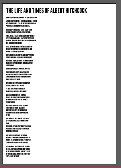
To go along with this, I produced what would appear like an old-fashioned Hitchcock poster with the use of a white and black photo and the juxtaposition of the luminous yellow to break the image apart. This is reminiscent of 'The Birds' poster as it uses the harsh yellow on the white whilst having the main text and image the most dominant within the poster. I described the main people within his life, Alma, Patricia and himself as 'starring' as to give them impression that they are actors within his life, just like how actors would in a film. I titled the poster The Life and Times of Alfred Hitchcock', to give it the appearance of being a movie that has been created as well as orientating the readership quickly so that they can pick up the information.
 |
| Finished Poster |
I kept the font capitalised but I centred the titles and played around with the font sizes and spacing to give them impression of a hierarchy like it would be traditionally on a film poster. I stretched the font to see if it would have more of an elongated effect but this seemed to take away from the proportions which effected the poster in a negative way.
Having included a poster of his private life, it was only fitting I produced one which included a filmography.
 |
| Filmography Initial Start |
I started off as a timeline but having the dates in a column to the side so as to go along with the columnisation/ boxing off of information that is prevalent in the posters. The timeline was having information in the same style as the biography poster where it is sentences so there is a bit of consistency. I felt it would be a good idea to have the information and dates connected by a disconnected, wonky line Saul Bass style.
 |
| Initial Filmography Development |
Having it as a graph was a good theory at the time but the way I had drawn it wasn't very appealing when I put it into the practice of having it as a poster. It looked very separate and removed from the ideal of having it as a poster, even when I included a quote to orientate the audience. I decided that it just wasn't giving the aesthetic that was needed and scrapped this visual.
 |
| Developing Timeline for Filmography |
Working from this, I went onto finding a title for the poster to go along with the quote and began to play around with the layout of the timeline in regards to placement, size and
 |
| Filmography Poster Layout |
As an idea, I decided to include a list of Hitchcock's finished and published works in chronological order down the side of the timeline which development led to this eventually becoming just having the film names and dates as the information. I felt that this gave a much cleaner aesthetic and would allow for a quicker way of distributing information to my target audience.
 |
| Experimentation of the poster aesthetic |
I continued experimenting with the layout of my timeline as I experimented with the idea of having a photo or an image that my timeline would be rested on. I tried colour combinations and filters on the images but I found that the image didn't really add to the visual aesthetic in regards to being related to Hitchcock. The image was just there. From this, I got rid of the image and decided to just work on the type itself.
 |
| Filmography Poster |
I changed the title to another Hitchcock quote which I felt was a lot more relevant of the subject matter as well as being more successful in regards to being a title for a possible movie he would make. I changed the font to make it larger and I included Hitchcock's name over the title as that was a traditional aspect of his movie posters that was normally included. I enlarged the font size to get rid of some of the large amounts of space and to draw attention to the middle, which has now had points added to the timeline. Then I alternated the font colour from red and white so that it would give more of a visual, optical effect. Hitchcock would make the audience feel uneasy within his films and so I used this to give the feeling of uneasiness. I am really happy with this typographic-based layout as I think it is a great visual interpretation and it doesn't need to have visuals for the audience to immediately see the influence.
I couldn't go onto producing a series of posters without looking into trying out a Saul Bass style poster based on just illustrative imagery.
 |
| Initial Illustration |
I found a great quote which Hitchcock describes his attitude to producing effective tension and his approach to the technique of suspense. It highlights how Hitchcock knows his audience and understands how he can manipulate them to his advantage. I decided to accompany this quote with the image of a bomb with a very long fuse to accompany the imagery of the quote. I went onto producing more linear and disjointed lines to give the most abstract stye that Bass would use.
 |
| Suspense Poster Development |
I went onto including a large splash of colour as Bass' was not afraid to have wild amounts of colour within his posters. The odd shapes produced is only added to by the colour choices which are clashing and disconnected. The trouble is that the poster appeared quite dark so I swapped the font colour from black to white which started to brighten it up a bit.
 |
| Suspense Poster Colour Change |
I swapped the colour backgrounds to blue and black so that the contrast was a lot more shocking and in-your-face. I swapped the colour of the bomb to yellow rather than black as it seems more shocking that it is in a warm, peaceful colour. For added emphasis, I made the point size larger for the fuse as it had faded away into the background due to the colour contrast.
 |
| Suspense Poster Development |
I felt that the cold blue was too harsh on the eyes of the audience so I changed the colour into a sea green which seems quite peculiar and unusual so adds to the mystery behind Saul Bass. This allows for the yellow to sit better on the poster as well.
I hadn't touched on the motifs that occur within Hitchcock's films as of yet so I felt it was relevant to look into this. Some of his motifs include the accusation of the innocent, guilt and the cameo which I felt could work visually together.
I produced a side profile view of Hitchcock which could work as a mug shot and tried the image inverted as well as with a colour and felt that a traditional black and white was the most successful. I haven't produced a black and white poster yet and felt it would be nice to play with this as a palette as to replicate the media that Hitchcock used for most of his film career.
 |
| Type Addition |
I added an interesting fact about Hitchcock's use of cameo within his films as I felt that it would be something that many people wouldn't know. I decided that it would be interesting to make the poster interactive by encouraging the audience to find out for themselves by watching the films and finding out for themselves therefore I added a question directly at the audience of 'Can You Spot Hitchcock?' as it would fit with the silhouetted image which gives an anonymity to him. The use of the font 'Courier' was chosen as it gives the impression of a warning or a ransom note which I felt added to the ambiguity of the image.
 |
| Accusational Tone |
I included the 'WANTED' at the top as it gave the impression of a wanted poster in itself so it appears more accusational, thus would go with the motif of the innocent being accused wrongfully. I wanted it to capture the attention of the audience and for the message to be immediate.
 |
| Cameo Motif Poster |
I laid out the type and added additional words so that the spacing within the image was more considered and equal. This gives it an easier legibility and readability as previously it had been quite jumbled up. I tried it with having a different background to give the impression of it having it produced through montage, another Hitchcock technique, however, I felt that it was way too overwhelming and disconnected as a poster.
I wanted to visually show some of Hitchcock's technical ability exorcised within his films and one of his most famous is the Dolly Zoom.
 |
| Initial Design |
I took the overhead spiral shape produced by the Dolly Zoom within the film Vertigo and initially drew it out but then I felt like it was too much like the original poster image so I decided to have the shape shown through the layout of the body copy. The body copy is a mixture of a quote and an explanation to the audience, using Vertigo as the example to give the shape its contextual reference. I played around with the placement as I felt that it was typical being in the middle and I felt that being in the middle was again to similar to the original, iconic poster.
 |
| Layout Development |
By moving the main focal point to the top of the poster, this left room for a header which, most importantly, gave the impression of a film poster as it was more in a block and connected. I don't like the yellow text next to each other however, so I might try and break that up a bit so it's more aesthetically pleasing. I titled the poster 'The Effect' as the dolly-zoom created the effect of moving whilst being able to see into the distance. This was named the 'Hitchcock effect', 'Vertigo effect' and the 'Dolly- zoom' effect so rather than get into specialities, I decided to title it 'The Effect' as it sounds like the film that Hitchcock would produce based on it's ominousness.
 |
| Dolly- Zoom Effect Poster |
I went onto experimenting with the use of colour, having the combination of red, white and yellow to go with the Filmography poster so there was some connection. I felt that the white font on red was good but I felt that it didn't work as a block when put with Header text. By adding the lined swirl alongside the text in the yellow to contrast the white font, it makes it more hypnotising and disorientates the audience further, allowing the audience to feel what the character's feel when confronted by this site.
Another way of being able to visually analyse the theory and practise of Hitchcock was by showing some film theory behind the work.
 |
| Chronological Layout |
I got out a film theory book and found that producing film stills which shows a scene of a film was a great way of visually showing the techniques behind a scene. The shower scene from Psycho is a strong and visually emotive piece of cinema so I produced 25 stills from that scene and arranged them in chronological order in order to produce the story through visuals alone. Hitchcock was a huge fan of storyboards and would produce them before creating the scene so I liked that it would be showing how Hitchcock visually sees his own work to a new audience. I made the last still a lot bigger in size than the others because I wanted to emphasis the finality of death which is what Hitchcock would do by lingering on one image for a few seconds longer than the rest so it could sink in to the audience which is why I decided to have it produced larger and on a wide angle.
 |
| Filter Manipulation |
I tested out what it would be like to add some opacity filters to the photo stills as old Hitchcock posters would have filters on the photograph of the actors and, in particular, the Psycho films made use of a yellow or blue. I felt that the blue worked alongside the subject matter as it added to the coldness and the starkness of the violence that is being showcased. The yellow added a warmth to the stills which just didn't work with the eeriness that the blue produced.
 |
| Tag Line Tryouts |
I felt that it wasn't very poster like with just stills so I tried to include a tag line or a quote yet these only seemed to ruin the imagery and take away from it. They didn't seem to fit in with the image itself.
 |
| Background Considerations |
I realised that the poster didn't need a tagline as the film stills themselves managed to describe the story I was giving and didn't need the addition of the type. I tried what it would be like to have a strong background colour but I felt that it was way too overwhelming and the greyscale style of the stills were quite draining on the colours I selected. Instead I decided to try and neutral coloured background which would be very pale but would compliment and work alongside the stills which it did.
I felt that I needed to have more analytical approaches to the posters so I felt it was a good idea to compare some of Hitchcock's films with later films to show the extend of how Hitchcock influenced Hollywood and the film industry and how he influenced from when he was still making films to Blockbusters nowadays.
 |
| Original Placement |
I laid out the images in columns, having the Hitchcock films and the relevant later film next to it so the audience could visually seen a similarity between the pair and make the comparison for themselves.
 |
| Image Layout |
I ordered the images into chronological order on the side of the influenced so you would be able to see how Hitchcock's influence has spanned many decades and over several eras in film. I began to include a header and tagline to my poster to orientate the audience because, without text, it wasn't as obvious as to the subject matter and context of the poster. This would have made it difficult to understand the message I was getting across even though I'm sure you could clearly see the comparison even without a header.
 |
| Comparison Poster |
I started laying around with colour backgrounds, typefaces and placements with different layouts to try and find a suitable one. I tested out futuristic style fonts and heavier, shorter typefaces but I felt that a American Typewriter font, which has a long body, gave the impression of a random note and the fact that the influences have abducted some of the scenes as there own made it all the more relevant. The placement of the header was something that I struggled with, as I felt that the top wasn't readable and placing it in the middle meant that it caused a break up in the information which wasn't welcome. The red coloured text made the header stand out and gave it some much needed definition as it disappeared when amongst the rest of the black text and gave the impression of the poster being a page of randomness rather than a poster. The opacity and filter added to the background goes well with the colour range that Hitchcock would use in his films, having tested out a range of them which I deemed unsuitable based on how well the images would sit with the colour. The typeface choice and images give the impression of quite an old-fashioned poster and I felt this was quite fitting.
Finished Posters:
 |
| Digital Versions |
Even though they are all different, I think they work effectively well as a set due to the close connection that they have together based on the subject matter and I feel as though they work as a series that documents different aspects in a suitable manner.
Printed Versions:
7 A2 posters digitally printed on Satin/Gloss paper to give the sheen of a traditional film poster.
 |
| Photos of Printed Posters |
Satin paper stock was chosen for the glossy sheen it would give as it would give the aesthetic of a movie poster, particularly for the slick texture that it would give the poster designs.
Packaging:
In regards to packaging, I wanted to package my work in a film reel canister to link with the subject matter of film. I liked the physicality of the canister and how it gives my posters some bulk and the impression that they could be a collectors item.
 |
| Film Reel Canisters |
I knew that the smaller sized reel would too small due to the surface area that the posters would have as an A2 size, even if folded up.
 |
| Tester |
I folded up the A2 poster into 4 which allowed for the poster to fit snuggly within the canister with a little room to spare so it would be easy to remove and put back.
After this worked, I folded all of my posters and put them within the packaging.
 |
| Packaging with Contents |
I feel as though the Film Canister gives a strong identity and provides more of a physicality to the product as well as having a place where all of the contents can be protected and kept together. The canister is quite bulky yet has the novelty of being something which would be appealing to the mass audience.
Finished Product:
 |
| Finished Product |
7 A2 Digitally Printed Film Posters on the subject matter of Alfred Hitchcock, folded and packaged in a Film Canister which is available as a collectable for the audience of Movie-goers.
Overall, for this project, I have found it very difficult to grasp the need to have synthesis and what it means to be able to produce work based on a reflection of the theoretical within the practical. The change within my project at such a crucial point with such a small amount of time was very difficult to deal with, however, in the long run, I feel as though this would contribute more to the 'synthesis' aspect and the 'visual analysis' aspects of the requirements more than if I had been stubborn and continued with what I was doing previously. The posters I feel have a clear influence in regards to their aesthetics and if I had more time, I would have added to the collection. I feel as though the timeline poster is the most successful as it is strong in its identity and doesn't rely on imagery to disorientate the audience. The least successful is perhaps the cameo poster, however, the idea and intention behind it is relevant to the context of Hitchcock's theoretical work. I feel as though the finished article is successful in regards to the limited time I've had to produce it and I would have liked to have more posters in an ideal world but it is still quite effective.