Tuesday 29 April 2014

Context of Practise 2: Studio Brief- From Theory Into Practise

For this brief, we need to take the subject matter of our 3,000 word essay and be able to produce a response to the topics covered, creating a synthesised project.

For my essay, I researched and wrote about 'How does consumerism manipulate our instinctual desires to create false needs' discussing the themes and aspects of humanity that advertisers use to get us in order to get us to part with our money. With this being the case, it was important for me to produce something that would relate to these elements.

I started off by producing a design sheet of some initial ideas onto how I could approach this dilemma.
Initial Idea Design Sheet
I thought that it would be very typical and expected if I was to produce an advertising campaign because, even though this would deb a solution, I would learn nothing from it. I decided that it would be really challenging to produce a product of my own which I could try and sell using the same principles that are discussed within my essay. I came up with the concept of trying to sell an object which was unsellable by making it look or appear/appeal to be desirable. I thought that this would tie in well to the synthesis of the brief.

I decided to develop the idea of selling a product but I decided to produce a product that we do not need available to sell. I felt that a great twist on this would be to sell something that is free but necessary for humans so that I had a wide audience that the product would appeal to. I thought about maybe sleep or blinking or perhaps even going as far as to selling nothing- my product being that of false promises with nothing of it.

Idea Development Design Sheet
From this inspirational thought, I decided to go down the road of producing a product based on the basic human need of air which jumps off the idea of selling nothing. Air is free to use and is necessary for us to live but what if I could make consumers buy it based on what the product looks like? I couldn't decided whether I would be better off producing a brand that would be quite old fashioned that had been going for years or a cool, modern brand but eventually I decided to go with the modern brand as it would tie in with being an unnecessarily fashionable fad or a trend. I came up with a few names based on the use of the product but felt that the would be obvious at what the product was doing so I decided to call it a term meaning air: Zephyr.

My main research on the topic can be seen within the essay but I looked at some design inspirations for research in regards to how I would be able to present this product:


"Hydrana" (2014) by Katie Tonkovich
Tonkovich, K (2014) "Hydrana" [Weblog] The Behance Network 21st April Available from https://www.behance.net/gallery/16284493/Hydrana (Accessed 19th April 2014)
These glass bottles allow for the audience to see the product with the brand label having all of the information in regards to the product so it doesn't distract. The brand logo is affixed to the bottle top and the white logo is stuck onto the bottle so it is subtle.


"Tine Melk- Mountain Milk" (2012) by Anders Drage
Drage, A. (2012) "Tine Melk- Mountain Milk" [Weblog] The Behance Network 18th June Available from https://www.behance.net/gallery/4262213/Tine-Melk-Mountain-Milk (Accessed 19th April 2014)
This bottle design is very minimal and sophisticated, allowing for the product to be seen through the packaging. It is a simple brand identity yet it is effective based on the reflection of the white on white which gives it a sterile and clean aesthetic. 


"The Chalice" (2012) by Lost & Found
Lost & Found (2012) "The Chalice" [Weblog] The Behance Network 17th October Available from https://www.behance.net/gallery/5547829/The-Chalice (Accessed 19th April 2014)
This bottle design is done for wine using a wrap around label that has been screen printed using some metallic inks on a thick stock to give it a luxurious quality feel. This is reflected in the black box packaging that gives an aura of mystery and depth.


"Campain Ice Hotel Part VI- Alcohols" (2013) by Elisa Gilis
Gilis, E. (2013) "Campain Ice Hotel Part VI- Alcohols" [Weblog] The Behance Network 30th August Available from https://www.behance.net/gallery/10613701/Campain-Ice-hotel-part-VI-Alcohols (Accessed 19th April 2014)
The wine and beer bottles are contemporary in their aesthetic, playing on illustration and colour to give a quirky and fun feel which would be desirable to young drinkers.


"Phero+" (2013) by Multiple Owners
Multiple Owners (2013) "Phero+" [Weblog] The Behance Network 17th April Available from https://www.behance.net/gallery/7781661/Phro (Accessed 19th April 2014)
The product and packaging for Phero+ is consistent throughout with the use of one colour and white to differentiate between the different perfume flavours. The bottles are carefully secured into the box by a steady platform hat they are slotted into to make sure that there is no spilling or breaking of the bottle.


"90S Absinthe" (2013) by Elmar van Zyl
van Zyl, E. (2013) "90S Absinthe" [Weblog] The Behance Network 16th July Available from https://www.behance.net/gallery/9855929/90S-Absinthe (Accessed 19th April 2014)
The product and packaging for some Absinthe appears to be very high end due to the use of all white and one use of colour. This gives a strong identity which is striking without having any detail on it at all.


"Nada" (2014) by Multiple Owners
Multiple Owners (2014) "Nada" [Weblog] The Behance Network 24th January Available from https://www.behance.net/gallery/13987513/Nada (Accessed 19th April 2014)
What is the most striking element of this packaging is the unconventional shaping of the structure and the main element of it being white with a hint of pattern at the bottom so it is not overwhelming and still looks chic and understated.


"SMPLSRVVL" (2014) by Lara Visconti
Visconti, L. (2014) "SMPLSRVVL" [Weblog] The Behance Network 1st May Available from https://www.behance.net/gallery/16551257/SMPLSRVVL  (Accessed 1st May 2014)
This packaging is simple and makes great use of the single colour for each different piece of camping kit, including the use of illustration. The brand is consistent throughout so, even though there are elements which are of different heights, it is clear that they are part of the same thing.

From this, I decided that I wanted to produce a brand that was simple, sophisticated, modern and clean. I felt that it would be an idea to produce a range of 4 different types of air that could be sold under the Zephyr name so as to give the consumer a choice between the type that they want with each one being defined by an image or colour so that the consumer could tell them apart.
Typeface Experimentation

I started off with experimenting with sans serif typefaces, trying out different ones so as to see which would give the best modern feel to my brand, giving the necessary aesthetic of being modern and sophisticated. It also needs to look quite clinical, like it is the latest must have beauty product or health benefit. I felt that the thinner typeface gave much more of a contemporary feel but I felt that the use of capital letters was holding the brand back as it comes across as quite harsh and stark.
'Seravek' Font Choice
Eventually, I found the font 'Seravek' which was modern and thin in weight. This gave the desired effect when used in lowercase because it was quite light and soft, like it was floating, similar to the brand and product that it is selling. Not only this, but it is legible and readable in both a large and small font size, as shown by the main brand name and tag line combination which reflects the logo drawings I had done on my design sheets.

For the brand, I knew that I wanted to work primarily with monochrome to have a very clean and chic brand. Saying that, to include different types of air, I feel that having maybe one colour per type will help differentiate between them.
Colour Scheme
I wanted the colour scheme to be quite neutral and use colours that were not too bright but subtle and understated therefore I stuck to simple hues which would work with the intention of it being a contemporary brand.

The next thing I needed to look into is producing the illustrations for the different types of air based on the colour scheme.


Original Illustration
To start off with, I worked on some simple illustrations which I enclosed in a circle as per my original drawings. I had them in the centre, having a line across the bottom to establish a defined middling. Each one is representative of a type of air with a wave depicting sea air, mountains depicting mountain air, fields depicting meadows and deserts for dry air. The illustrations for the air types are very simple yet to the point yet I don't want them to look too childish or naive so I am going to develop them.


Full Circle
I developed the initial drawings by getting rid of the back line at the bottom and expanding the image to the bottom of the circle so that it is much more full which defiantly looks more of an improvement. I tried to get rid of any other black lines through the drawings themselves so that it looks more natural.


No Circle
I decided that it would probably look less cartoonish by getting rid of the black circle outlining the illustrations but instead it made them look very out of context and got rid of the circular shaping due to the line work.
Coloured Circle
To counteract this, I decided to add the circle back on but apply it by having it in the same main colour as the rest of the image. This allows for a consistency and emphasis which is more sophisticated and would work well within the brand style.
Illustrations
Following this, I decided to use colour on the text as well so that the illustrations and the text coincide together to make more of a cohesive bond, particularly a differentiation between the types. It is a very simple device but, all the same, effective.

From this, I needed to decide how I was going to adorn my bottles.

Bottle Visualisation
It was important to consider how my bottles were going to look so that I could give the right aesthetic for it to appeal. I felt that having a label on the bottle would make the bottle seem quite cheap so I thought it would be best if I put stickers on the bottle. I decided that I would have the name of the brand on the sides it would automatically seem more modern and chic to the target market with the type of air displayed by the logo alone in the middle. This would be mirrored on the back by a circle sticker with information for the consumer. Over the top of the bottle would be a sticker to show that the product hasn't been opened so as to give the impression that the air is sealed inside.

To start with, I worked on the name sticker for the bottle.


Name Label Development
I started with playing around with the shape of the sticker and the placement of the information. I felt that a normal rectangle was too rigid and sharp for the aesthetic of the brand but a rounded rectangle was much softer and in keeping. I played with the ideal of having a full colour sticker and then a mainly white sticker to keep with the clinical look but preferred the full coloured labels as they had more of a personality. I liked the idea of having a section of the sticker cut out so the audience could see through it to the product but then I realised that this would be an absolutely pointless addition as the bottle will be see through anyway.


Resizing of Name Label
With that being said, I cut the size of the label down to literally the amount of room would be needed for the name and this created a much more minimal affect yet this also allowed for the product to be more visible.


Sticker Labels for Bottles
Alongside the name labels, I finalised my stickers for the bottles, with the image for the flavour going to be at the front of the bottle and adding a back label for the bottle as well which has a short description of the product on them and what type of air they are. The back reflects the flavour colour through the background colour and having the text written in the predominant white colour.

Stickers for Bottle Tops
I reflected this same style for the sticker bottle tops using the circular illustration for the top and the name of the type of air going down each side.

The next thing I needed to do is reflect this simple yet modern branding with equally sophisticated packaging.


Mock Up Bottle Net Packaging 1
I managed to find some plain glass bottles for the product and, in order to be able to produce the packaging for the bottles, I needed to be able to determine the measurements I would need for the packaging to hold the bottles securely. I measured them and produced a simple box net that I crafted so as to produce a box packaging. From this, I would be able to work out if it was of the correct size. It was a little too tall so I will take away an extra centimetre from the length.

Producing Net Digitally
I created the net on Illustrator using the shapes tools so that I was able to produce each individual section in the right size. 


Plain Net Aesthetic
I started to play around with the aesthetic of the box, in particular the colour scheme, but felt that the simple box would be seen as less desirable and make the product seem cheap.


Packaging Visual Development
I went onto developing some box visuals as to how I could produce the packaging into something which was more memorable. I felt that these would have a better visual representation as to the style I am going for. I tried it with all of the different types of air so that I could see which ones would work for all of the types.

I felt that the most successful of these were the middle and far right packaging as they came across as the visually desirable and had more of a demanding and sophisticated presence. I decided to try these out to see which would work the best.


Mock Up Bottle Net Packaging 2
To try out the most successful design, I produced the nets and tried by just having a top and a bottom half about 3/4 of the way down but this was a little short in length and didn't have as much of an impact as I hoped it would have.


Mock Up Bottle Net Packaging 3
Based on this, I decided to add to the net by having an inner section like I had done on one of my box developments. This made for a longer packaging cover for the bottle as well as a way of having colour to a three part packaging solution, thereby producing a more sophisticated solution.


Nets Digitally Produced
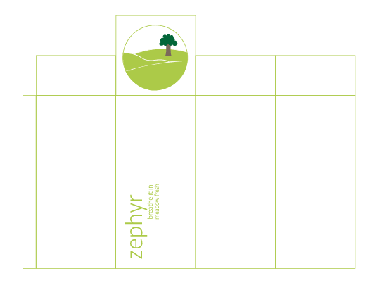
Like the original box net, I applied these nets into Illustrator using the shapes tool so that I could get them the correct size.


Box Packaging Nets
Using these guides, I produced the layout for the nets so that they would print correctly in regards to information placement and at the same size as each other. This was important for brand consistency and so that, when printed, they would all be in the same place of the net.


Preparation for Printing
To make sure that the nets were ready for printing, I got rid of the outlines for each section so that all was left was the information and the outside outline. This was so that it would not show up on the outside of the netting as that would look unprofessional. Due to the fact that I had taken the measurements previously of each section, I would be able to refer back to these measurements when I produce them.
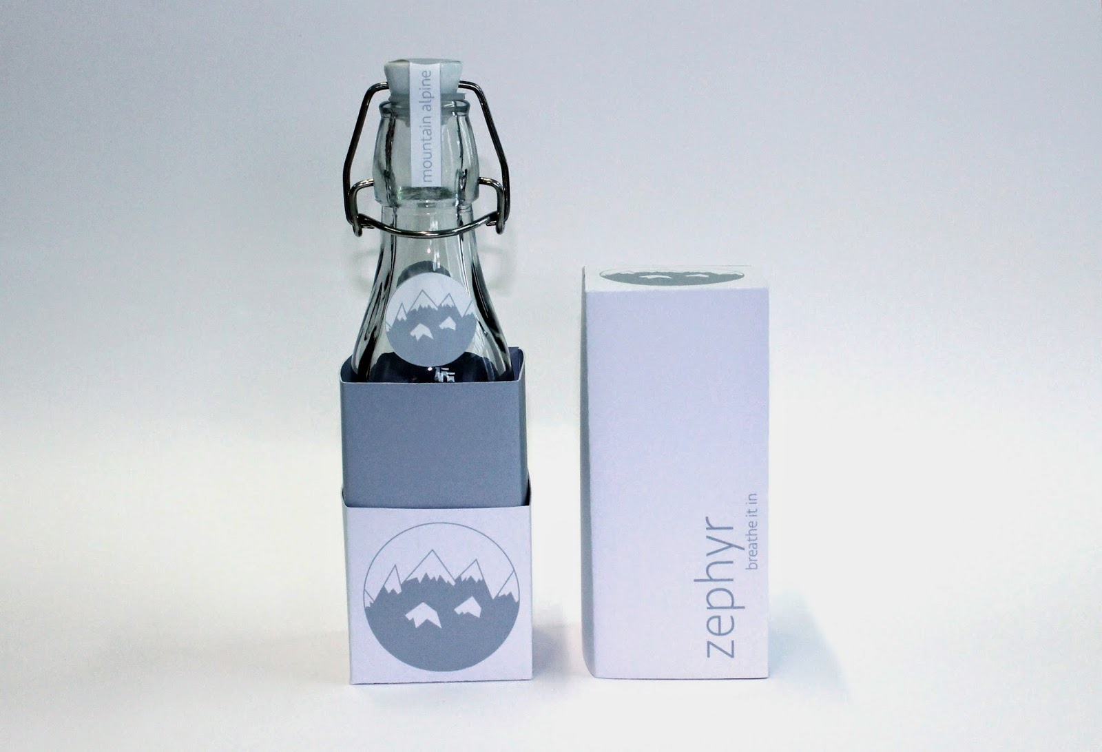
Printed Ephemera
I printed off the three different types of box nets onto some white card which will keep with the clinical aesthetic and minimalist style whilst printing the information for the bottles themselves as stickers so that I would be able to adhere them easily. The card was intentional as I needed a stock which would be stiff and strong to work as a package but which would be able to fold and bend in shape.


Cutting out, folding and crafting packaging nets
From that I had printed, I started off with the packaging nets and drew out the nets onto the card before cutting out the nets and folding them using a perforated edge created by lightly scoring at the lines with a scalpel. Then I connected the nets together to produce the boxes that I would need using double sided tape so that it was secure and wouldn't damage the box structures.

Affixing to the bottoms
For the coloured boxes to fit securely into the white bottom halves, I affixed them together with double sided tape and stuck the bottoms to the inside. 


Bottle Sticker Placements
Using the stickers that I printed, I placed them onto my bottles creating a distinctive identity for the products


Putting all the elements together
From this crafting process, I put all of the single elements together to produce the final products within their packaging. 

To go alongside this I decided to try and produce some poster advertisements that could work to promote the product.


Poster Attempts
I produced some poster designs based on the logo designs for the types of air and included slogans as to what the product achieves. I tried to show how the product would change varying consumers lives for the better stating health benefits and how much better it would make them. 

Despite this, I didn't think the images themselves were strong visually and I couldn't get them to work, making them an unsuccessful experiment. The posters would perhaps look better if I had them as photographic images but I didn't have time to produce them.

Final Product:

Product in response to the essay 'How does consumerism manipulate our instinctual desires to create false needs' through a range of branded air that has been packaging appropriately to create an instinctual desire for a false need. 


Finished Zephyr Products
I am very happy with the way that my products have come out overall as they give the impression of being a professional product that could easily be put on the shelf of a shop and sold to the public. I have never produced any work in this style before and I feel like it has been a successful achievement as it had blended my style of illustration and colour alongside creating a sophisticated packaging solution.

Overall I am pleased with the outcome of my project and I enjoyed it much more than I did the previous years attempt at this module. I feel that the product I have produced reinforces the main point of my essay and thus synthesises coherently.  If I had some more time, I would produce a campaign to go alongside this product, producing posters and shop signs and stands which would coincide with the product promoting it so it sells more.