Thursday 16 January 2014

Context of Practise 2: Lecture Notes- "Synthesis"

Thursday 16th January 2014
"Synthesis"
Richard Miles

Isn't art and design just about the visual?
- Need to think abut design rather that just doing it
- Pursue issues in more depth
- Form own conclusions independently or practitioners and academics
- Experiment with ideas to see if they work in practise- individual research

Through synthesis, we can show:

Knowledge and Understanding 1:
- Knowledge and understanding of different contexts to the individual subject
- PEST (Political, Economical, Social, Technological) analysis
- How our work affects these elements

"Dead End Streets" by David Hoffman
- Police surveillance on protesters is turned on its head
- The relationship between contemporary photography and surveillance
- How anyone can become a documentary photographer- transform of social relations amongst each
  other
- Method of social control by monitoring and recording- Use of photography as a political tool

Cognitive skills
- Ability to use logic, reasoning and critical judgement to analyse ideas from a range of sources
- Photography contact sheets- showing how you are thinking and applying criteria to the selection of material you will use
- Logical thinking to the development of practical work

Practical and Professional Skills
- The capacity for undertaking practical and theoretical research that demonstrates an info red application of critical, effective and testable processes.

Key Transferable Skills
- Organise and carry out self-directed project sand communication outcomes through written and other appropriate forms

Knowledge and Understanding 2
- An awareness of the relationship between the theoretical and practical contact of their own creative concerns
- Synthesis- A tight, symbiotic relationship between the theory and practical

Synthesis
- All component part of the project engaging in one complex dynamic process
- Informed engagement
- The realisation of theory in and through practise
- The philosophy of PRAXIS

"Philosophers have only interpreted the world in various ways; the point is to change it"
- Marx Theses on Feuerbach

- Making and thinking are two different sides to human investigation of the world
- The practical wisdom is brought together by the abstract philosophy
- Needs to be something more to it then making something because it looks nice

Kolb's Experiential Learning Theory
- Making and doing intertwined with theory and reflection creates something powerful
- Forcing you to think about what is actually happening

Practitioners are right to worry that academic study of what is essentially a hands-on subject removes it from the reality of practise

Designers often work intuitively, without knowingly applying theory. This module aims to get you to reflect on that process.

Thursday 9 January 2014

Context of Practise 2: Lecture Notes- "What Is Critical Analysis"

Thursday 9th January 2014
"What Is Critical Analysis?"
James Beighton

Critical Analysis
- An appraisal based on careful analytical evaluation
- Central process involved in all academic work
- Applying rational and logical thinking while deconstructing different texts

What is it?
- Considering the claims of theorists, governments, authorities, ect. and how far they seem to apply or be relevant to a given situation
- Anybody writing on a subject- looking at the claims of other people and applying them in a context given

Why use it?
- Key skill for writing essays
- Accessing various ideas and information and deciding whether you want to use these points
- It is something we do everyday, by accessing information and making reasoned decisions from it, e.g. believing what is said on TV
- Being able to agree or disagree with an argument
- Being able to make a point, back it up with evidence and explain your point to be able to make an informed opinion on the subject matter

How does it work?
- Carefully considering an idea and weighing up the evidence supporting it to see if it convincing. Then being able to explain why it is convincing

Bloom's (1956) Hierarchy/ Taxonomy of Thinking Skills

Bloom's Taxonomy
Based on 6 levels of knowledge (Higher knowledge as it goes up):

  • Evaluate- make value judgements about the value of the information
  • Synthesize- combine ideas or information into something new
  • Analysis- make an examination of a piece of research
  • Apply- use knowledge
  • Comprehend- have understanding
  • Know- be aware of something

What is the difference between Descriptive writing and Analytical writing?

"Time Magazine cover" (14th September 2001)
- 9/11 bombing with the planes crashing into the Twin Towers
- Sign of western domination and economy
- Significant event in world history

"Party Music" (2001) The Coup Withdrawn CD Cover
- Before 9/11
- Can be assumed to be referencing what has happened which can create a strong negative emotion
- If the towers weren't bombed, people may not have been bothered about this image
- Trying to represent the lack of money and desired upbringing that the towers represented

Some considerations which make up the context of image:
- Date?
- What is it?
- What is it for?
- Who is the Target Audience?
- Who produced it?
- Is it fit for purpose?
- Where was it produced?
- How was it produced?

Practising critical analysis on text:
- Who is the author and what is their viewpoint or bias?
- Who is the audience and how does that influence the way information is presented?
- What is the main message of the text?
- What evidence has been used to support this main message?
- Is the evidence convincing? Are there counter-arguments?
- Do I agree with the text and why do I agree or disagree?

How to get more critical analysis into your essay:
- Avoid unnecessary description
- Only include general history if it adds to the argument
- Interpret your evidence- explain how and why the evidence supports the point and your interpretation of it
- Be specific- avoid making sweeping generalisations or points without any evidence. Be precise.
- Use counter arguments to your advantage- include an opposing viewpoint to strengthen a viewpoint

How to criticise the work of established academics:
- Read other academics and practitioners with different views
- Look for practical evidence that may support of refute the established theory

Hw to criticise others work:
- May the author be biased?
- Do the author clearly outline the theoretical based?
- Are the authors methods trustworthy?
- Are there arguments supported by relevant evidence?

Is it about criticising others work?
- Yes, but but you need to integrated different sources of information to provide a fuller picture
- Give an overview of the topic
- Provide practical evidence to illustrate and support your arguments

"The Work of Art in the age of Mechanical Reproduction" (1936) by Walter Benjamin 
- Socialists who approached the world in terms of reading after Marx
- Talks about how the work of art changes in this era
- A unique work of art as an enigmatic aspect to it

"That which withers in the age of mechanical reproduction is the aura of the work of art"
- Walter Benjamin

- The notion of the one off thing which has a magical quality which is changed due to the reproduction of the image, making it one of many.
- The tremendous shattering of tradition

PRESENCE + AUTHENTICITY+ AUTHORITY = AURA

"Chairman Mao" by Andy Warhol
- The plurality of images
- There is no history which is encapsulated by the reproduction of the image

"Chairman Mao with Bullet Hole" by Dennis Hopper
- Reinstatement of the aura to the image
- Become far more individual that the other reproductions

Critical Analysis at Play:

"Triumph of the Will" (1935) by Leni Riefenstahl
- Piece of Nazi propaganda
- Read what you see based on what you now know

"Triumph of the Will" Film is played by U2 as they come on for a show
- Propoganda style video playing with the media
- Referencing how the media persuades
- Decontextualise and Re-contextualise the video- the people in the stadium don't know they are watching Nazi Propoganda but there was a surge of emotion in response when it was played

Friday 3 January 2014

Studio Brief 3: Design For Print and Web Research

The first port of call for research in my Design for Print and Web brief was to look at a couple of different typographic terms that I could use to base my Restaurant on.

A very useful source I found was Typography Deconstructed website which has a large source of typographic knowledge
"Anatomy of Type Poster" (2010) by Typography Deconstructed
Typography Deconstructed (2010) "Anatomy of Type" [Internet] Available from http://www.typographydeconstructed.com/shop/products/digital-poster/ (Accessed 27th November 2013) 
This poster that is sold on the website breaks down the different elements of type and different parts of various typefaces whilst giving a guide to the side of the poster stating the details of each anatomy point. The fact that the website, like on the poster, highlights the physical attribute of the type anatomy in the blue colour shows it much more clearly to the designer so they know exactly what they are looking for.

From this poster, I looked up some of the physical attributes to type which I felt could constitute as a possible restaurant concept.


Traditional Names
The main ones I looked at were based around the idea that they have names which could easily be associated with food or a restaurant. Terms like Counter and Bar could be used to describe the type of restaurant whereas Bowl describes a utensil. Despite the fact that they easily lent themselves to the task, I felt that this would be a real obvious answer to producing a restaurant identity.

I went onto looking at names which would give a very good concept rather than a typical name for a restaurant.


Abstract Concepts
Beak made me think of a poultry restaurant, Hook made me think of a barbecue or a seafood restaurant and Swash made me think of pirates. All of these terms are abstract and allow for a much more interesting approach to the brief.

Eventually I decided to go for Swash, a typographical flourish, which made me think of Pirates which made me shape and mature it into a seafood restaurant. I went onto having a look at seafood dishes to see which I can include onto my menu. I didn't want to have a large range as I want the restaurant to be independent and specific.


"Seafood Recipes" by Jamie Oliver
Oliver, J. "Seafood Recipes" [Internet] Available from http://www.jamieoliver.com/recipes/seafood-recipes/ (Accessed 4th January 2014)
The way that these meals are presented are appetising, modern and inventive which gives the opinion to the public that they would be made for a high end restaurant by a Michelin star chef. At the same time, they are accessible to a wide audience who would to go to a restaurant and be served food of this quality.


"Christmas Eve Seafood Dishes" (2012) by Adolph Di Mambro
Di Mambro, A. (2012) "Christmas Eve Seafood Dishes" [Weblog] granpalovetocook 23rd December  Available from http://granpalovestocook.blogspot.co.uk/2012/12/christmas-eve-seafood-dishes.html (Accessed 4th January 2014) 
At the same time, seafood can be presented in an unappetising manner which doesn't look appealing  to a consumer highlighting how easily it can be badly done. There are many examples of this being done in restaurants and I want to be able to steer away from that by making my restaurant a high quality, middle class audience so that I can focus on the ideal of serving gourmet food rather than 'pub grub' which can be associated with seafood.

What I found from this was that the best seafood meals are those which are presented in high quality luxurious manner. This has helped my considerations in regards to the meal quality and the audience that I am going to focus on.

I went onto looking at web and print designs that I felt were either good restaurant references or specifically to do with Seafood.


 "Italio" by PUSH
PUSH "Italio" [Internet] Available from http://www.pushhere.com/case-study/italio/ (Accessed 31st December 2013)
This website works off a landing page and gives a bit more of an interactive experience to the users. The navigation bar at the top of the page is consistent throughout the pages alongside the display of the information in a linear scroll.


"Iceberb Seafood Restaurant" (2011) by Meidei
Meidei (2011) "Iceberb Seafood Restaurant" [Weblog] The Behance Network 16th June Available from http://www.behance.net/gallery/Iceberb-Seafood-Website/1634569 (Accessed 31st December 2013)
This website looks into the history and philosophy of their products and how they have developed. It offers a timeline and showing the variety of fish available. The design is very illustrative led but this aesthetic links with the sustainable and natural message that the brand is trying to give off.


"Whitman NYC" by Gin Lane Media
Gin Lane Media "Whitman NYC" [Internet] Available from http://portfolio.ginlanemedia.com/portfolio/#Whitman%27s+NYC (Accessed 31st December 2013)
I like this modern website which is contemporary and clean, with a clear identity throughout. It is a strong, easy to navigate website which starts with a landing page and creative loading page and has different pages which have a unity amongst themselves.


"Cantilever Fish & Chips" by Evolutia
Evolutia "Cantilever Fish & Chips" [Internet] Available from http://www.evolutia.co.uk/work (Accessed 31st December 2013)
This web design is very quirky and illustrative giving an aesthetic of a moody atmosphere acting on the traditions of a fisherman. It suits the brand of the restaurant but it does come across as a bit dark and uncompromising.
"Neptunus Seafood Website" (2013) by Joel Vereycken
Vereycken, J. (2013) "Neptunus Seafood Website" [Weblog] The Behance Network 10th October Available from http://www.behance.net/gallery/Neptunus-Seafood-Website/11404053 (Accessed 31st December 2013)
This concept for a seafood restaurant website takes on a strongly illustrated- influenced design to show where their food comes from and the depths of the ocean. I feel like the fact that the website just has links to other websites rather than has information and pages of its own seems to be a bit of a cop out and appears unfinished.

Based on my idea to produce a Seafood restaurant, I went onto looking at design inspirations on Seafood Restaurants to see what I would be able to include and the style I want to go into:


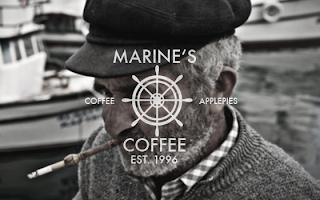
"Marine's Coffee" (2013) by Michael Wekesser
Wekesser, M. (2013) "Marine's Coffee" [Weblog] The Behance Network 30th October Available from http://www.behance.net/gallery/MARINES-COFFEE/11812201 (Accessed 3rd January 2014)
The brand identity for this sea-inspired cafe is very atmospheric and dark, attempting to give a sort of cold and chilling approach to a visual identity however, due to this, it doesn't make it very inviting or encouraging place to visit showing how the aesthetic has been thought of over the consumer. Despite this, the actual logo and typeface choice is beautiful and does go well with the moody shots.


"iFish Seafood Restaurant" (2013) by Haifa Hadi
Hadi, H. (2013) "iFish Seafood Restaurant" [Weblog] The Behance Network 25th December Available from http://www.behance.net/gallery/iFish-Seafood-Restaurant/13353715 (Accessed 3rd January 2014)
The concept of a fish restaurant which is quite futuristic seems quite interesting yet the actual conception of the brand seems quite disjointed and incoherent with what it is suppose to be selling. As a consumer, I wouldn't know straight away what it was suppose to be so I wouldn't be inclined to visit.


"La Fish" (2013) by Hey Renata
Renata, H. (2013) 'La Fish" [Weblog] The Behance Network 1st September Available from http://www.behance.net/gallery/Lafish/10674077 (Accessed 3rd January 2014)
This brand identity is a bit hit and miss in regards to the development of the brand, as it is very disjointed between the physical menu and the sophisticated imagery used. The website seems to be very well laid out and gives the restaurant a classy impression working alongside the print yet the menu front cover is extremely tacky so there doesn't seem to be any solid cohesion. The colour choice of sunset yellow is vibrant and fresh giving them impression of being inviting and natural.


"Seafood Grill" (2013) by Sundus Asif
Asif, S. (2013) "Seafood Grill" [Weblog] The Behance Network 10th November Available from http://www.behance.net/gallery/Logo-Design-Seafood-Grill/11157435 (Accessed 3rd January 2014)
The modern and clean brand identity for this restaurant is very simple and makes for a sophisticated restaurant. The branding is consistent throughout the print and web establishing the restaurant firmly in the mind of the locals. The fact that it comes across as a relaxed yet mature place to dine would encourage potential diners to come through the doors. 


"The Oyster Factory Seafood Restaurant" (2013) by Mia Almaguer
Almaguer, M. (2013) "The Oyster Factory Seafood Restaurant" [Weblog] The Behance Network 22nd October Available from http://www.behance.net/gallery/The-Oyster-Factory-Seafood-Restaurant-and-Bar/11647921 (Accessed 3rd January 2014)
This brand identity oozes exclusivity as it has a textured background and a silver and gold serif text. This gives the impression that the restaurant is for upper-class rich customers who can afford meals like oyster. The brand is quite restricted by the lack of collateral and could be expanded into something much more. 


"Mr. Crabs Restaurant" (2013) by Fransisca Oktiviani and Shelvy Wijayanti
Oktiviani, F. and Wijayanti, S. (2013) "Mr. Crabs Restaurant" [Weblog] The Behance Network 1st December Available from http://www.behance.net/gallery/MR-CRABS-RESTAURANT/12698051 (Accessed 3rd January 2014)
This broad range of collateral of print and web for the restaurant is illustrative and playful which gives the impression of being open and inviting. The restaurant design mixes illustration and photo-manipulation to get a strong brand identity that is appeal to all the family. 


"Seaside Cafe and Restaurant" (2013) by Sorbet
Sorbet (2013) "Seaside cafe and Restaurant" [Weblog] The Behance Network 16th January Available from http://www.behance.net/gallery/Seaside-Cafe-Restaurant/6691715 (Accessed 3rd January 2014)
The brand identity for this seaside cafe is that it is quite bland and plain yet it is very fitting to the atmosphere and tone of voice necessary for a seaside based cafe. The colour scheme is quite fitting and work very well together, as the pastel shade compliment each other and don't seem too overpowering, giving the cafe a quiet yet quaint characteristic which is reflected in the font choice. 


"Gills Seafood" (2013) by Phil Nehammer
Nehammer, P. (2013) "Gills Seafood" [Weblog] The Behance Network 7th February Available from http://www.behance.net/gallery/Gills-Seafood/7049411(Accessed 3rd January 2014)
The presentation of the collateral for Gill's Seafood is mature and self-assured, with the monochrome colour scheme and mixture of script and serif fonts adding a sophisticated aesthetic to the brand. The name is playful yet, despite that, I wouldn't be able to identify that it is a seafood restaurant straight away yet I think this is intentional by the designer.


"JUNCALITO" (2014) by La Carbonera
La Carbonera (2014) "JUNCALITO" [Weblog] The Behance Network 2nd January Available from http://www.behance.net/gallery/JUNCALITO-Restaurant-Bar-/13452931 (Accessed 3rd January 2014)
The typographic elements of the brand identity are very strong and experimental with layout and composition. This would make sense however, as the brand is mainly based on these type elements but this can sometimes become quite overpowering and very busy with so much information going on at the same time. 


"22 Ships" (2013) by Foreign Policy
Foreign Policy (2013) "22 Ships" [Weblog] The Behance Network 12th June Available from http://www.behance.net/gallery/22Ships/9260143 (Accessed 3rd January 2014)
The use of letterpress printing to give the impression of being aged works well with the worn and aged appearance of the collateral as it makes you imagine that these had been found from a shipwreck. All of the collateral are unified without being exactly the same so they work on an individual basis as well as together thereby keeping the brand identity string throughout. The choice of the red colour wouldn't make you think of a seafood restaurant but it goes well wight he worn, shipwrecked theme as it looks like it has rusted away.