As a group, we brainstormed different categories we could put the letterforms in, such as:
- Lowercase/Uppercase
- Serif/ Sans Serif
- Image As Type
- 2D/3D
- Plain/Decorative
- Black & White/ Colour
- Scale
- Modern/Traditional Styles
- Line Thicknesses
- Handwritten/ Computer Generated
- Straight/ Curved
Eventually, we managed to settle on these 10 and ordered the letterforms accordingly (see pictures):
 |
| 2. Sans Serif |
 |
| 3. Image As Type |
 |
| 4. Illustrative |
 |
| 5. Line Thicknesses and Weights |
 |
| 6. Uppercase |
 |
| 7. Lowercase |
 |
| 8. Shape |
 |
| 9. Detailled |
 |
| 10. Scale (Big to Small) |
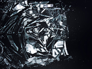
From this, we were assigned a word which we were to base the letterforms physicality on. I was given the word 'SHATTER'. For my research, I decided to find out the dictionary definition of the word and then thought of any synonyms of 'Shatter' which would give me more to work from. That way, I could approach the brief from many different angles and have several ways in which I could approach the meaning/interpretation of the word, 'Shatter'.
Shatter (vb) 1 to break or be broken into many small pieces as by a blow 2 to impair or destroy 3 to damage, as by breaking or crushing 4 to weaken, destroy or refute 5 to be broken into fragments or become weak or unsubstancial 6 to dumbfound or thoroughly upset 7 informal, to be tired out or exhausted
Sinclair, J, M. (1999) "Concise English Dictionary"2nd ed., Glasgow: HarperCollins Publishers
Shatter Synonyms- Batter, Blast, Blight, Break, Burst, Clatter, Crack, Crash, Crunch, Crush, Dash, Demolish, Destroy, Disable, Exhaust, Explode, Fracture, Fragment, Fragmentalise, Fragmentize, Impair, Implode, Overturn, Pulverize, Rend, Rive, Ruin, Scrunch, Shiver, Smash, Smithereens, Snap, Splinter, Split, Total, Wreck
By finding these ways of interpreting the chosen word, it will allow me to approach the brief from different ways than expected. Giving not just literal or physical applications of the word but also other variations of the use of the word 'Shatter'.
Graphic Design Influences
After researching the word itself, I thought it would be relevant to research how other designers have interpreted the term 'Shatter' within thier approach to design. I managed to find 2 examples which interested me and I thought would be good visuals to start from.
 |
 |
| "Lightbulb Typography" by Ben Brears Reference- Brears, B. "Lightbulb Typography" Available from http://www.brears.co.uk/#Lightbulb-Typography (Accessed 2nd Oct 2012) |
Out of these 2 images, (which stand together to make the work "Lightbulb Typography"), the one that holds the most relevancy to my work I feel is the 1st image. Ben Brears has managed to produce the word 'Bulb' by smashing and shattering the glass in lightbulbs, emphasised by the messy and unconventional media. The media gives the letterforms a different tone of voice as it causes the word to seem harsh and dangerous rather than just being a neutral object of unimportance. The fragmentation surrounding the main word gives an unsophisticated appearance, however, I think this only adds to Brears intention towards the aesthetic and enhances the disconnected imagery.
 |
| Still from "You Blow Me Away" by Craig Ward & Jason Tozer Reference- Design Is Blank " You Blow Me Away" [weblog post] Available from http://designisblank.com/2011/02/craig-wards-you-blow-me-away/ (Accessed 2nd Oct 2012) |


No comments:
Post a Comment